We're hiring – Experienced UX/UI Designer wanted! Find out more

tlc-header.png

Traveline Cymru

Putting a face on public transport info

Services
  • Brand strategy
  • Brand identity
  • Collateral
  • Illustration
  • Campaign
  • Brand guidelines
  • Copywriting
Sector
  • Public
  • Transport
Traveline Cymru

Putting a face on public transport info

Background

Traveline Cymru (TLC) is a public transport information service funded by the Welsh Government. Delivering in excess of 5.6million pieces of information each year, they work in partnership with operators and local authorities to provide public transport information across the United Kingdom.

Their primary purpose is to offer a ‘one-stop-shop’ for public transport information, where users can plan journeys, see disruptions, diversions and service alterations in a few simple steps online, through their app or by phoning their north Wales-based contact centre.

Whilst their technology had moved on significantly, TLC’s brand had become stagnant. This was confirmed by large-scale, independent user and stakeholder focus interviews and questionnaire responses. Some of the key points raised included a preference to appear more Welsh with a dislike for the existing orange and green colour palette repeatedly highlighted. Additionally, there was some confusion over a diluted product offering; people weren’t quite sure what Traveline did. Following a competitive pitch addressing these and numerous other insights, were the riddles that needed to be solved.
pieces of public transport information delivered

...and rising every year!

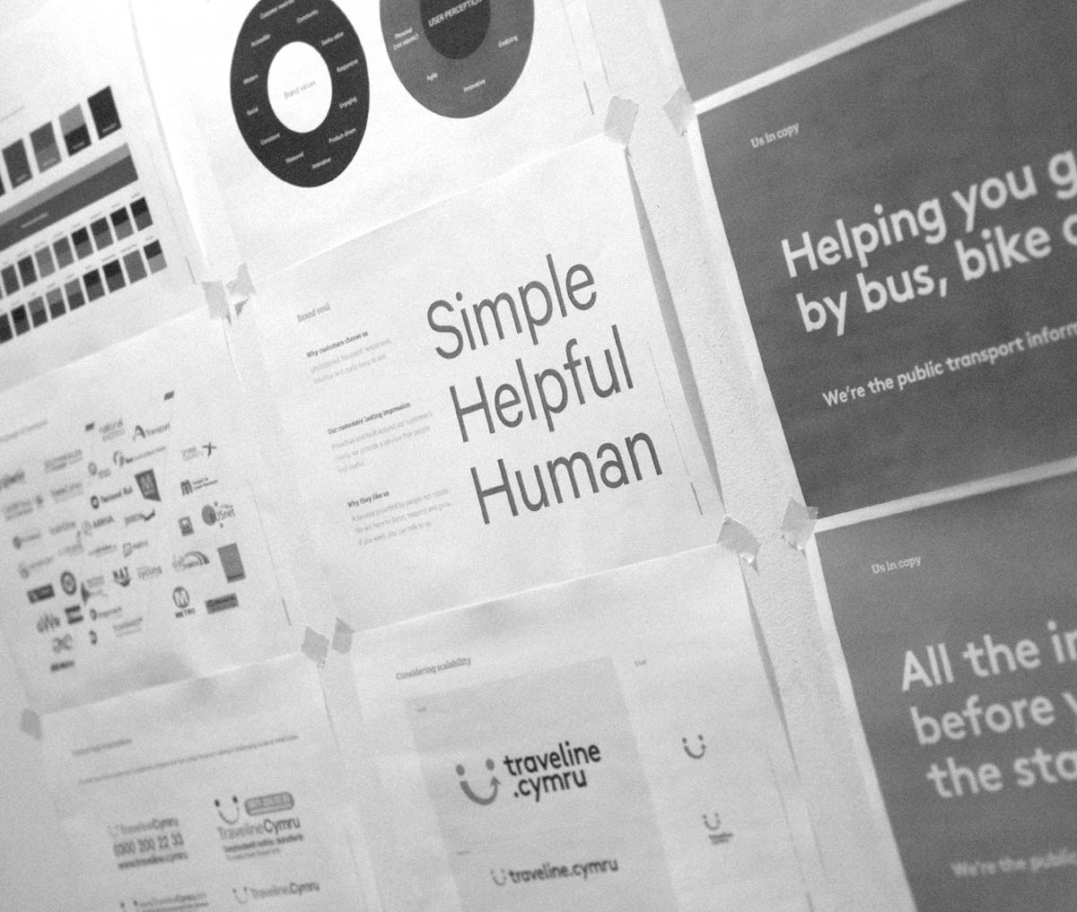
Simple, helpful, human

Having worked with TLC over a number of years on campaigns and promotions we felt we had an acute understanding of the organisation’s mechanics and brand challenges. Our strategy therefore centred around a simplification and reseeding of the brand, renewing a culture and product wrapped around a promise of being simple, helpful, human.

Simple is why customers choose TLC – uncluttered in design, focussed, responsive, intuitive and really easy to use; helpful is their customers’ lasting impression driven by need not tech, providing a service that people find useful; and human in why customers return – a proactive service for all ages driven and delivered by people not robots or bottom lines. There to listen, respond and grow. Near-instant information in a few clicks or, if you like, available for free at the end of a phone.

This spirit provides the foundations for the brand inside and out, informing everything from product development to choice of messaging to graphic language and beyond. It provides the blueprint of a clearly laid out and simplified positioning.

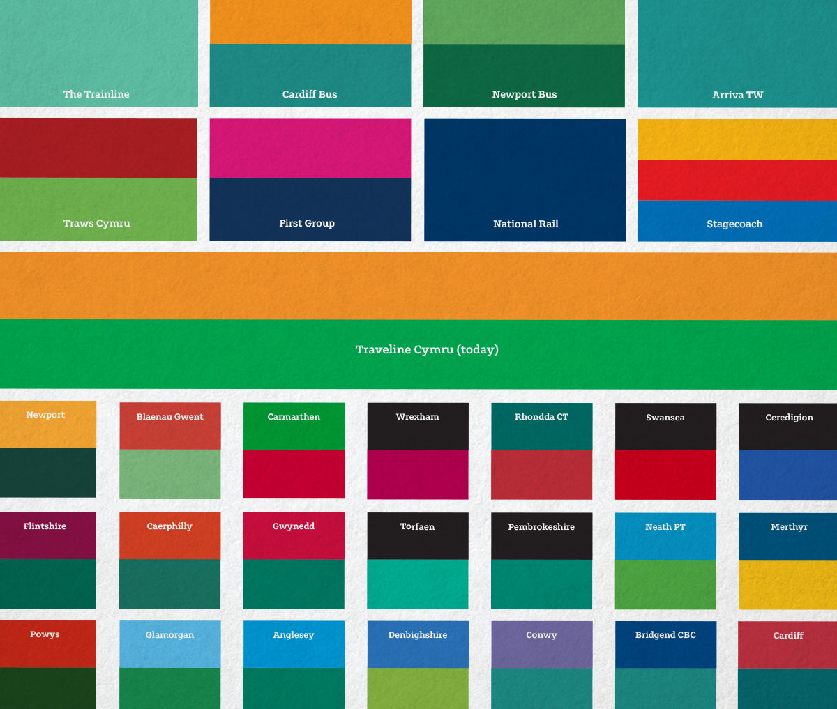
colour space
sample presentation deck
tlc-oldvsnew.jpg

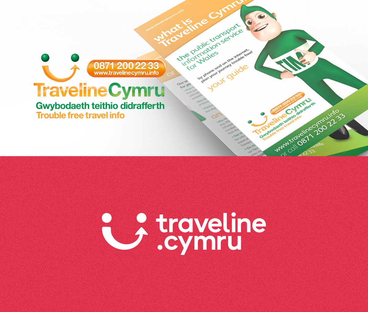
The previous logo, most recently updated in 2010, was rightly singled out as being dated, cluttered and dysfunctional. Keen to modernise, the time had come to say goodbye to longstanding 3D mascot TIM, but perhaps the most dramatic shift was in ditching their traditional green and orange colours. Given the existing equity it was a bold call, but the case to do so was compelling – a market space colour audit revealed an overwhelming wash of variations of greens and aquas, remarkably popular with both councils and operators alike. A different approach was needed, it was time for a change.

tlc-brand-assets.jpg

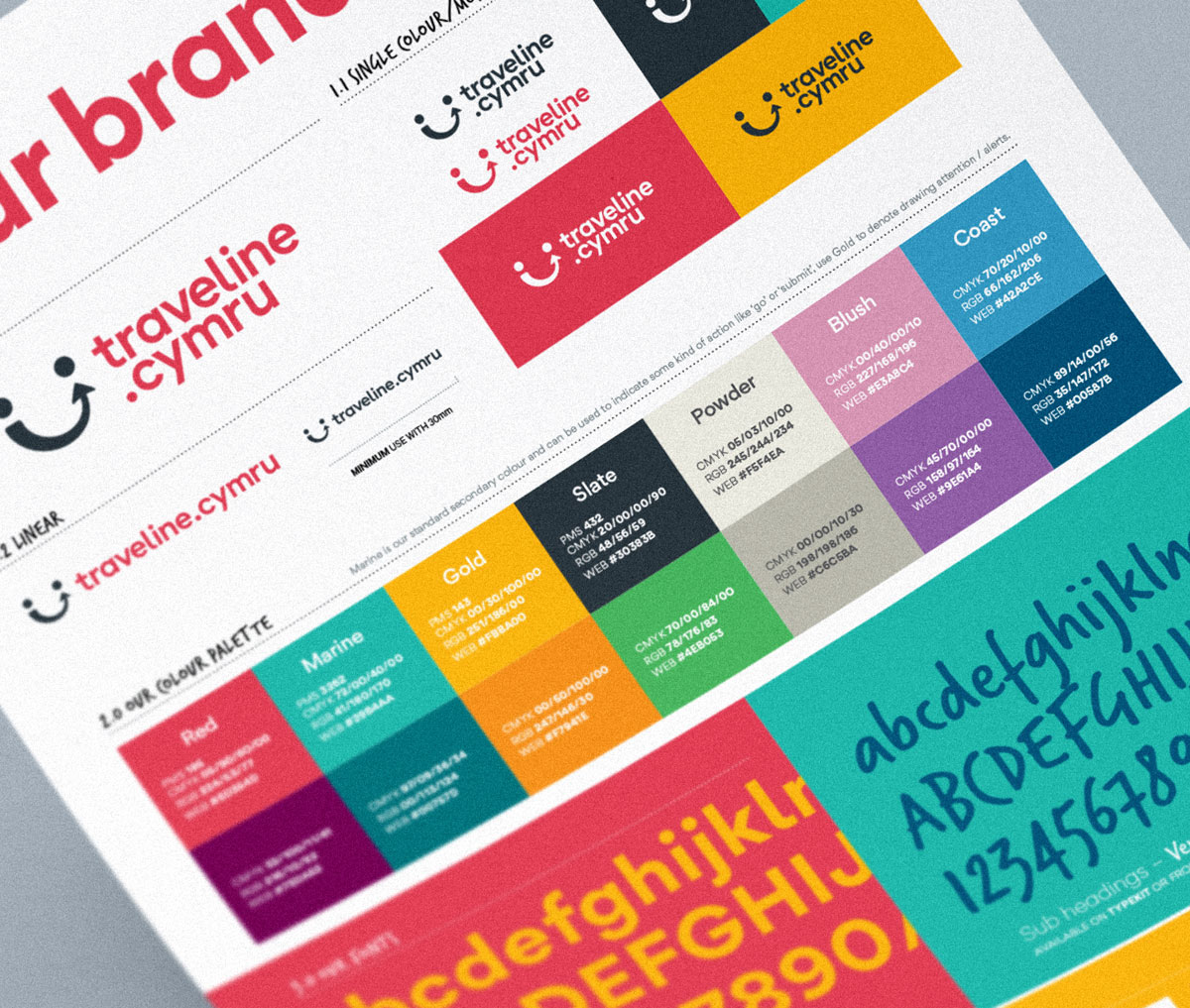
Led by a punchy red and supported by slate, marine, gold and a handful of other vibrant colours, the brand fills with vivid and engaging liveliness, providing a foundation to develop brand appeal across a broad demographic spectrum.

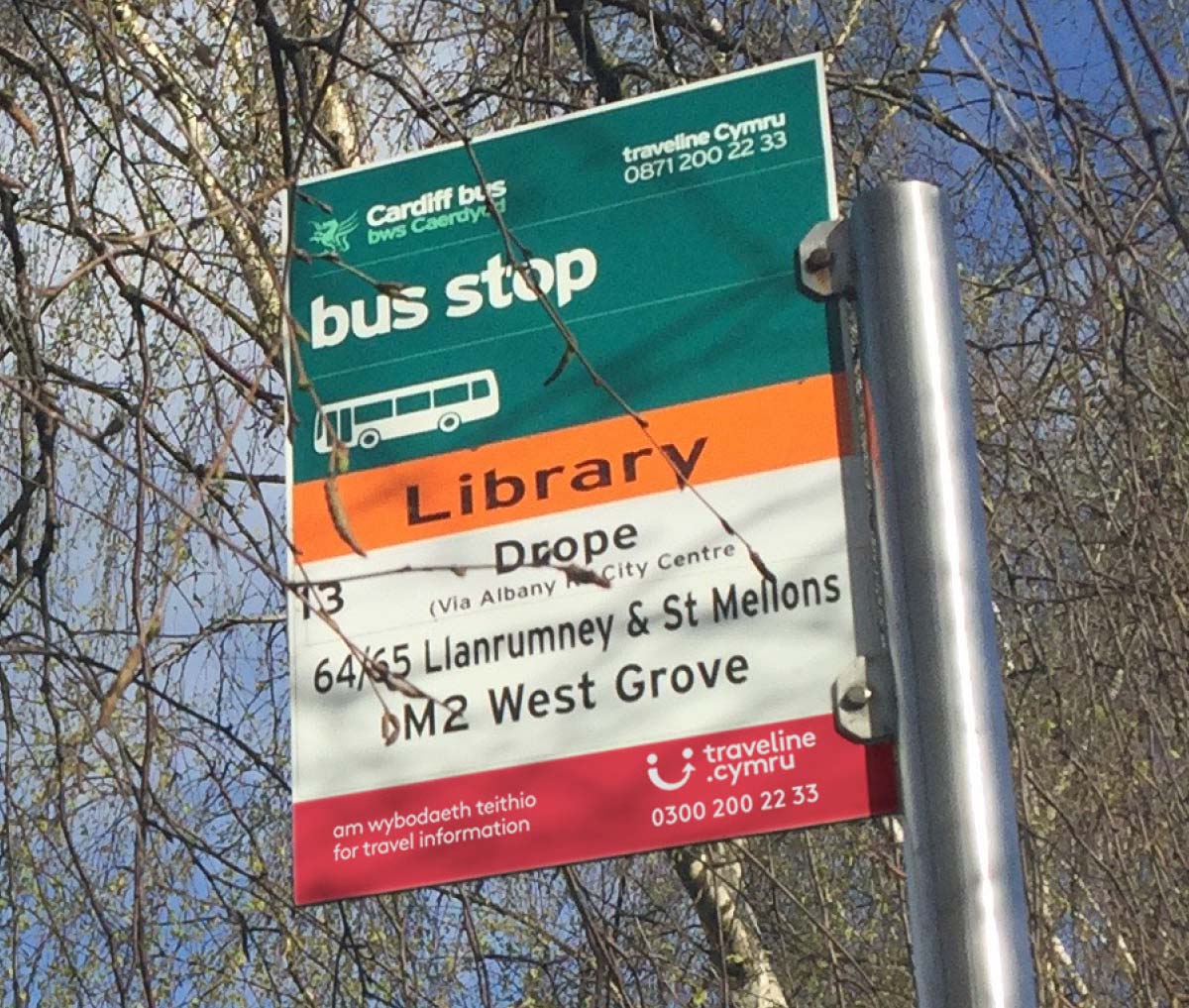
The identity itself increases the thickness and therefore digital impact of the ‘smiley journey’ icon, adding softer rounded corners. Doing away with the frivolous strapline and contact lozenge, the type is set in an adapted version of Gordita and introduces a dot, highlighting their new home at the .cymru URL. The hand-written style face Verviene by Dalton Maag softens the brand, providing a human warmth to messages and calls to action.

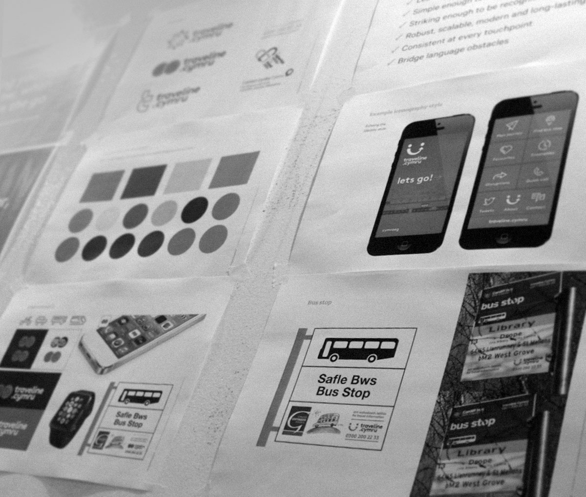
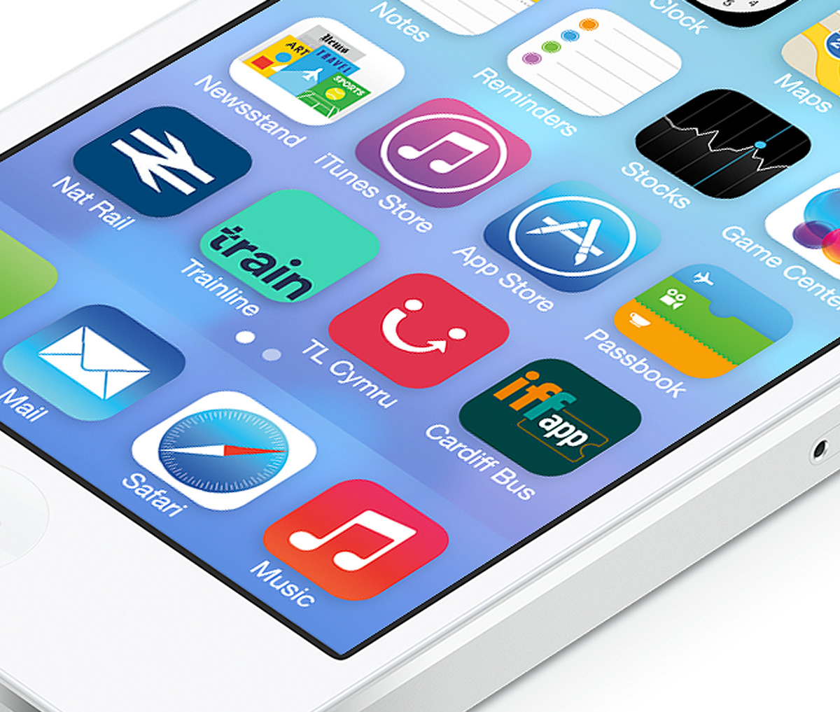
app icons
app launch icon
flag

We, the people

Against a backdrop of swiftly evolving technology, enabling quick access to info from a clutch of national and big budget players like Google, Trainline, National Rail Enquiries, First Cymru, Arriva etc and, granularly, localised operators including Newport Bus and Cardiff Bus, Traveline Cymru was struggling to stand apart and make noise.

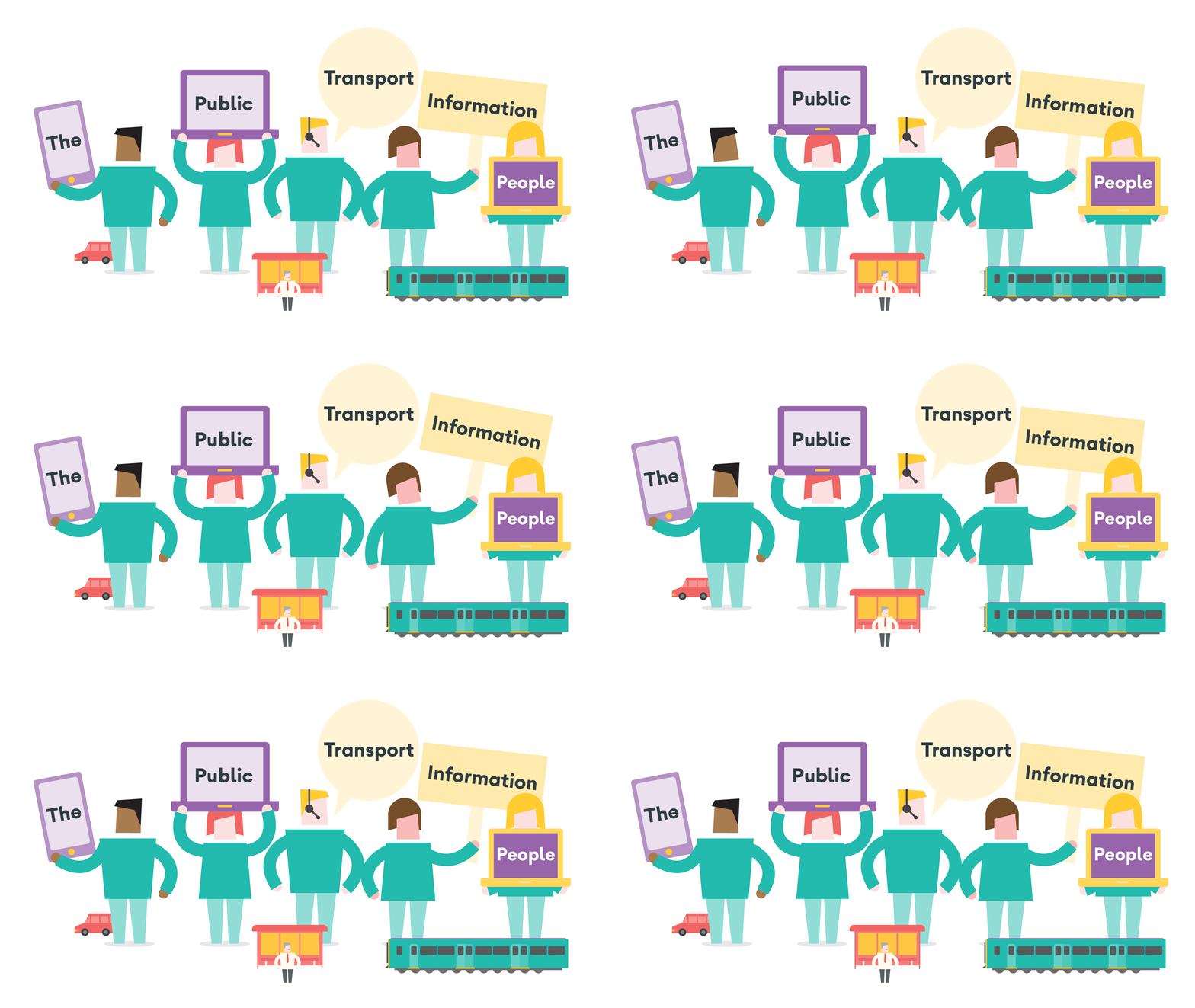
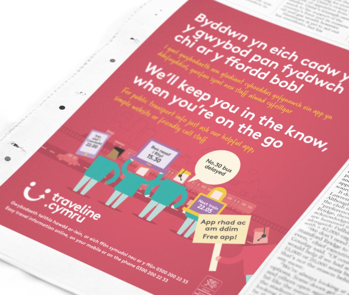
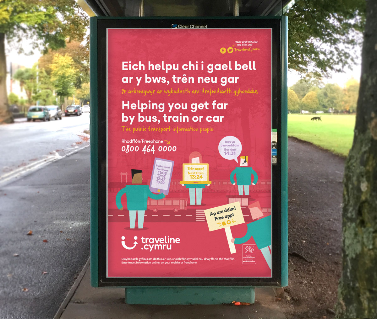
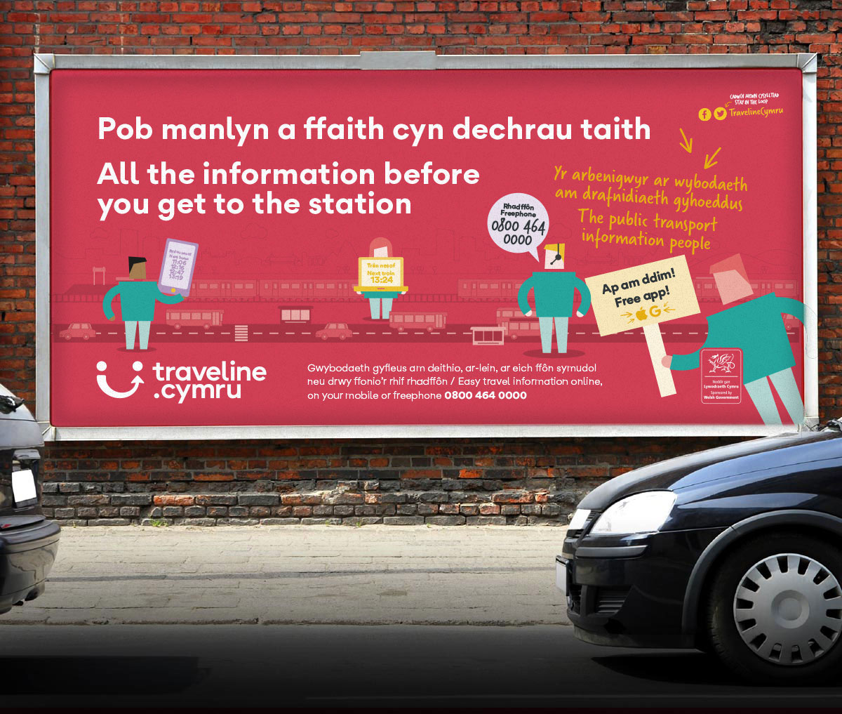
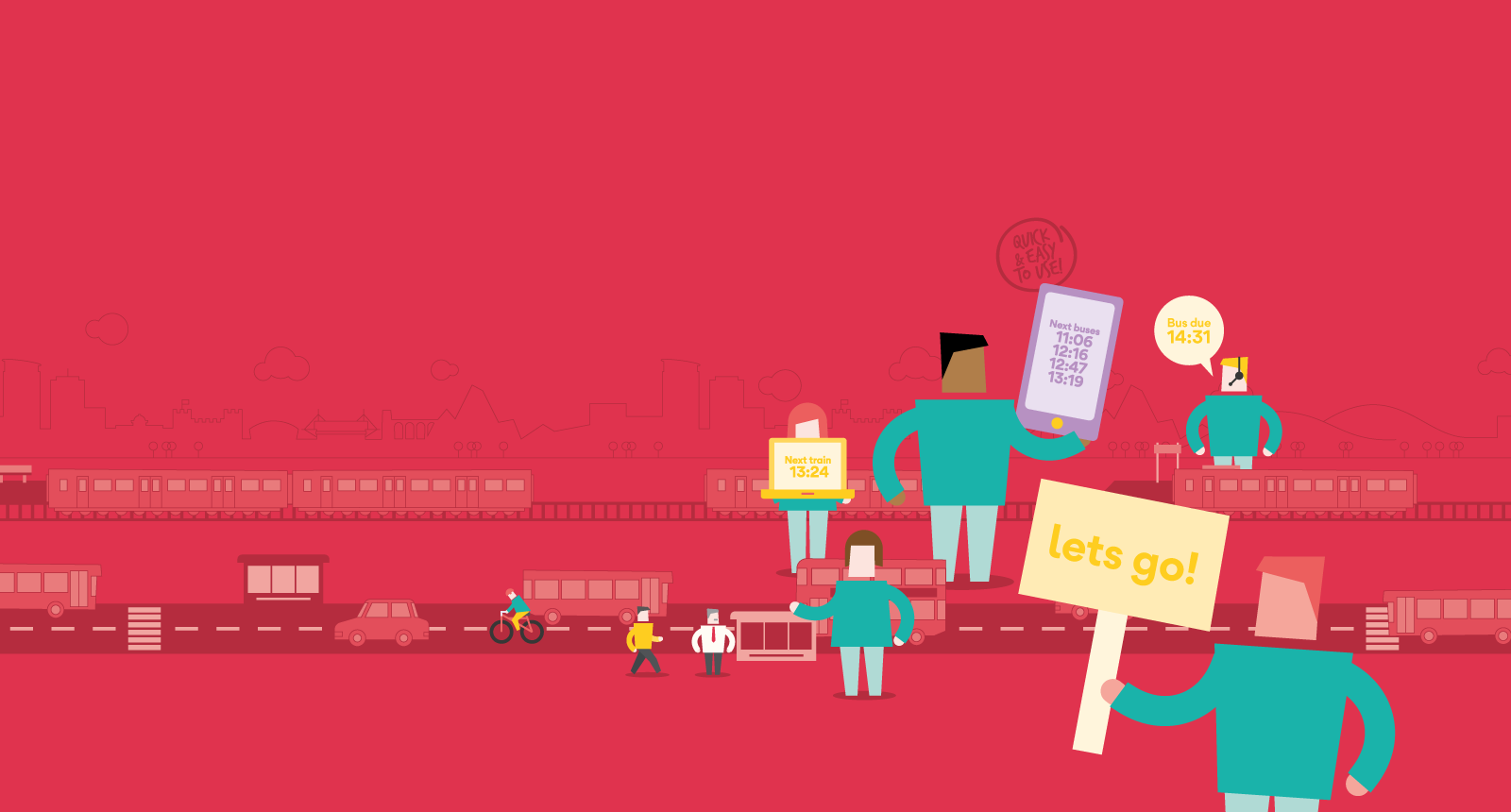
Playing to their core strengths of people operating multi-platforms to provide fresh information, the re-positioning of TLC re-casts them as, simply, The Public Transport Information People, placing them front and centre in people’s minds as the go-to folks. We developed a distinct illustrative style to embody and characterise TLC, paired with bouncy, rhythmic headlines.

tlc-1600x850-2.gif
advertising
advertising
advertising

Responsive

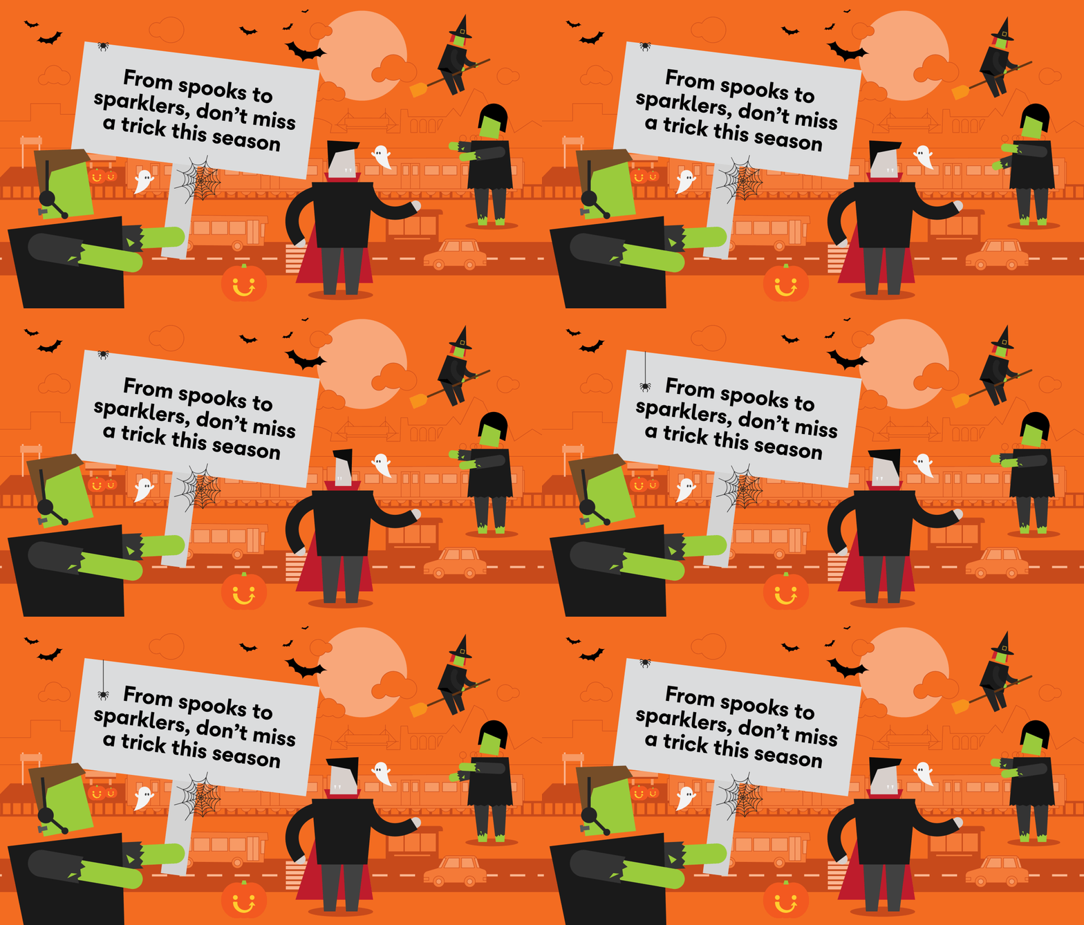
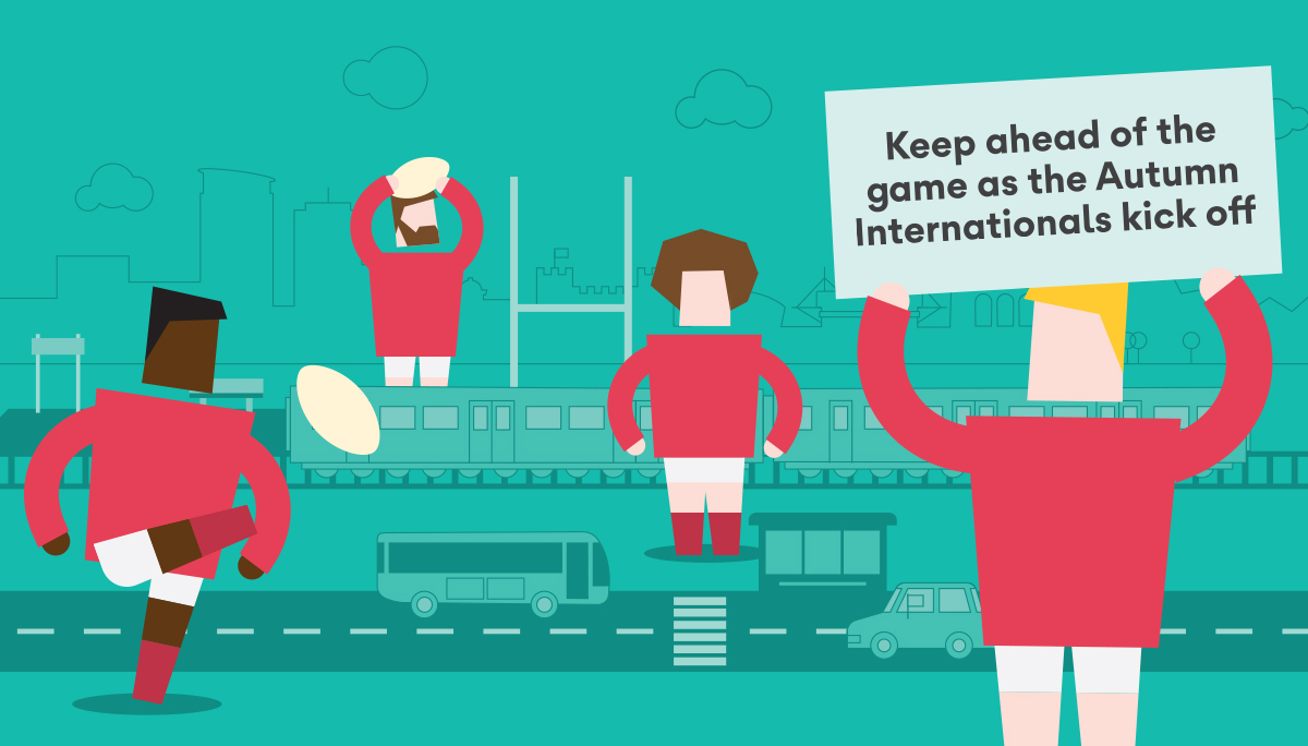
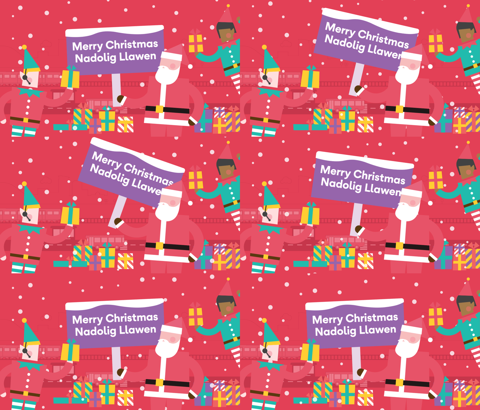
The flexibility of the illustrations allow TLC to react, respond or take ownership of events and seasonal messages via their social channels – each instance strengthening the brand in a way photography (stock or otherwise) can not. Cheeky animated gifs or jpegs burst with personality and seed the visual language with entertainment beyond the delivery of data.

halloween banner
re banner
tlc-xmas.gif
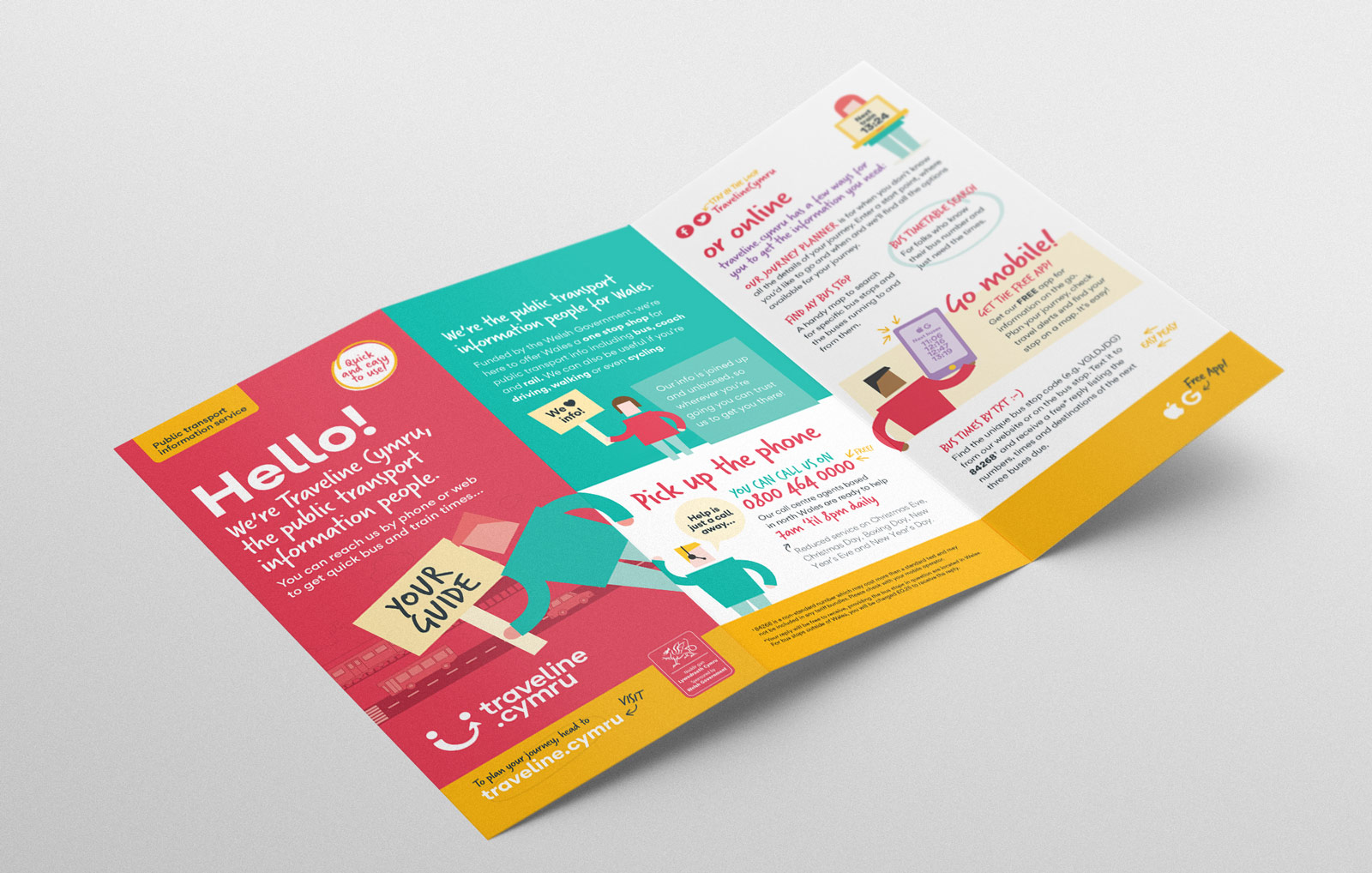
leaflet
Limegreentangerine won the business for our re-brand because they listened to our management, our staff, our customers and our stakeholders; and most of all they were compelling in their vision for where they saw our brand going.

It’s not easy for an incumbent supplier to let go of an existing brand which they themselves created, let alone come up with something so different, but right from the brief they recognised our desire to move some distance from the past, while being sensitive to the results of our extensive customer and stakeholder research. LGT were professional, agile and responsive to our needs at all times, and nothing was too much trouble. Graham Walter, Managing Director