We're hiring – Experienced UX/UI Designer wanted! Find out more

soha-banner.jpg

Soha Housing

The housing association for south Oxfordshire

Services
  • Brand identity
  • Collateral
  • Environmental
  • Illustration
  • Brand guidelines
Sector
  • Not for profit
  • Housing
Soha Housing

The housing association for south Oxfordshire

Background

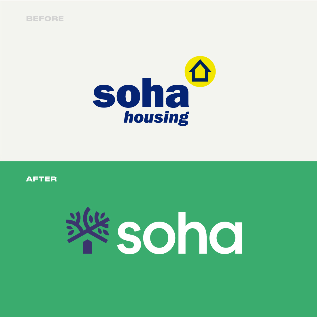
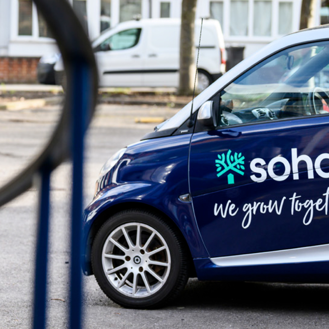
Managing over 7,000 homes across social and affordable housing, South Oxfordshire Housing Association (or Soha, to their friends) came to us to help focus their brand strategy and identity. Unlike most HA’s, Soha operates like a mutual organisation, allowing tenants to have a real stake and influence in the direction of the company, their homes and neighbourhoods.

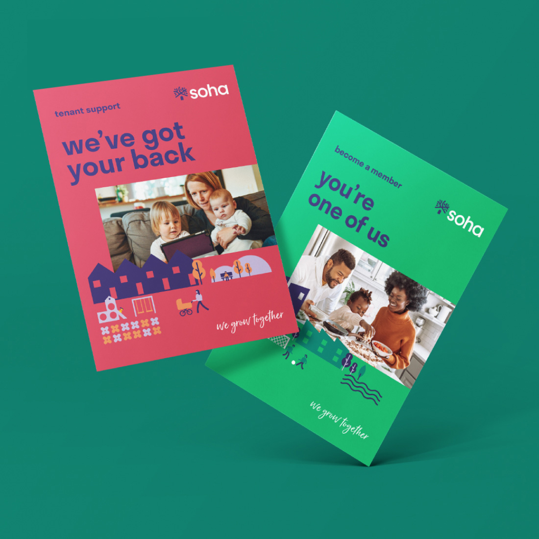
A home is a fundamental human need, providing safety, security and a wider sense of belonging, this means that housing is an emotionally rich brand category. It was important that Soha articulated a clear social purpose that activated throughout the brand, from its expression to the employee, resident experiences and beyond.

soha kids, green t

We grow together

Amongst all the noise, one simple human truth prevails “home is where the heart is”. Whilst other housing associations, charities and public bodies are growing, merging and becoming more commercially minded, Soha remains agile, purposeful, small and inclusive. This fosters a nourishing culture with deep-set roots. It was this notion of being mutualesque, Members and inclusivity, bonded by strength in numbers, that informed our brand anchor ‘We grow together’, helping create a feeling of positive affiliation or, as one staff member said to us, “we evolve because we involve our residents”. Soha are truly a driving force in helping to build strong, sustainable and vibrant communities in south Oxfordshire.

At the core of any identity system is the logo; a ubiquitous symbol instantly recognised and equipped to be the Soha masthead for the next chapter. A tree was an apt and simple symbol for Soha’s purpose. Branches spread offering hope, growth, shelter and deep-rooted stability to diverse and blossoming communities. Look closer and you’ll see a hidden house gable, the trunk doubling as a front door, a reminder that when you see the symbol, you are home.

logo before and after
animated logo
icon on app
soha logos

Building nests

A warm, bright colour palette and engaging photography mixed with a simply constructed illustration style, shows built communities in their elemental form — people and place together. The modular illustrations can be built or reconfigured to create endless arrangements that fill any canvas, space or compliment differing narratives. This confident, contemporary and clear visual language creates a highly flexible communications system. The new brand connects and engages with Soha’s audience, delivering an identity that is set to endure and ready to be built upon.

collateral
brand guidelines
branded construction hoarding
Limegreentangerine understood our vision and what made us unique. They worked methodically to engage a cross-section of staff and tenants from the outset and throughout; collecting views from right across our organisation which made everyone feel heard and part of the process. The results exceeded what we could have imagined and fit perfectly with us as we start a new chapter. David Reynolds, Communications Manager
logo before and after
application
application