We're hiring – Experienced UX/UI Designer wanted! Find out more

outback-cover-1-1.jpg

Outback BBQs

Good grillin’ is good livin’…

Services
  • Brand strategy
  • Brand identity
  • Ecommerce
  • Packaging
Sector
  • Food & drink
  • Retail
Visit
Outback BBQs

Good grillin’ is good livin’…

Background

Amongst the largest players in British barbecuing, listed in retailers including Homebase, B&Q, John Lewis and more, Outback have made quality and affordable barbecues and accessories for over 35 years. If you don’t own one yourself, chances are someone you know has served you a tastily charred sausage from one of their garden grills some time.

Until recently they were exclusively driven by sales direct to resellers, but with the company focus shifting towards direct-to-consumer sales for the first time Outback sought our help to define their brand and create an appealing visual identity, aiming to cement the Outback brand’s outdoor cooking ubiquity.

outback bbq logo

Good to grill…

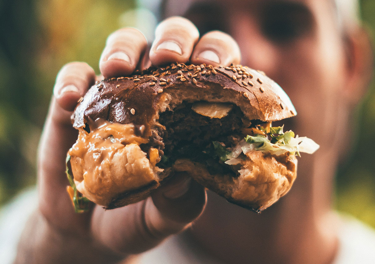
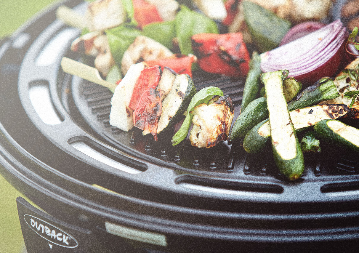
Small or large gatherings, BBQs are novel and often (weather)-defiant social occasions. The grill is usually the central character on the garden stage; folks congregate around it chatting, casting hungry glances at the sizzling feast as the bustle of the day plays out around its fringes. A BBQ brings people together—great company and simple food—the only ingredients required.

Though a proudly British brand, the name OUTBACK including the logotype and core colours eludes to an Australian grounding. This is amplified by notions that the spiritual home of BBQ’ing lives down under, so why would people question it? Not necessarily a bad connotation but a seeming identity issue.

blackwater gallery brand identity
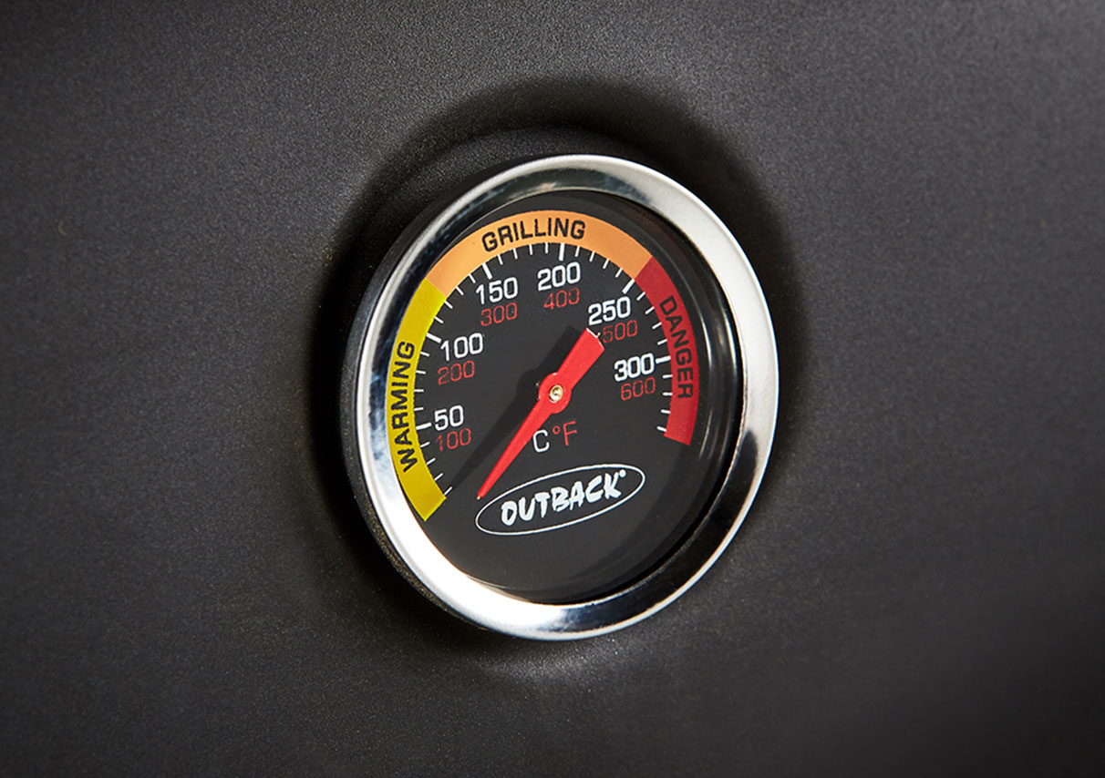
bbq
danger!
pattern-outback.jpg

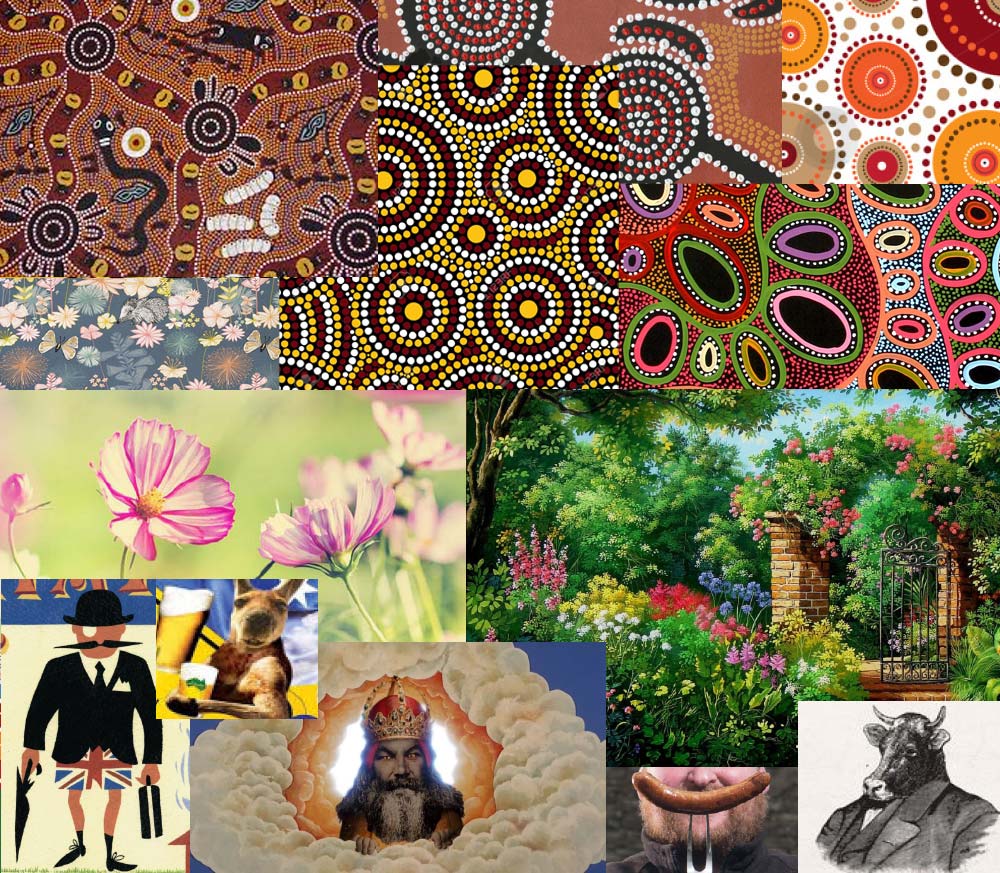
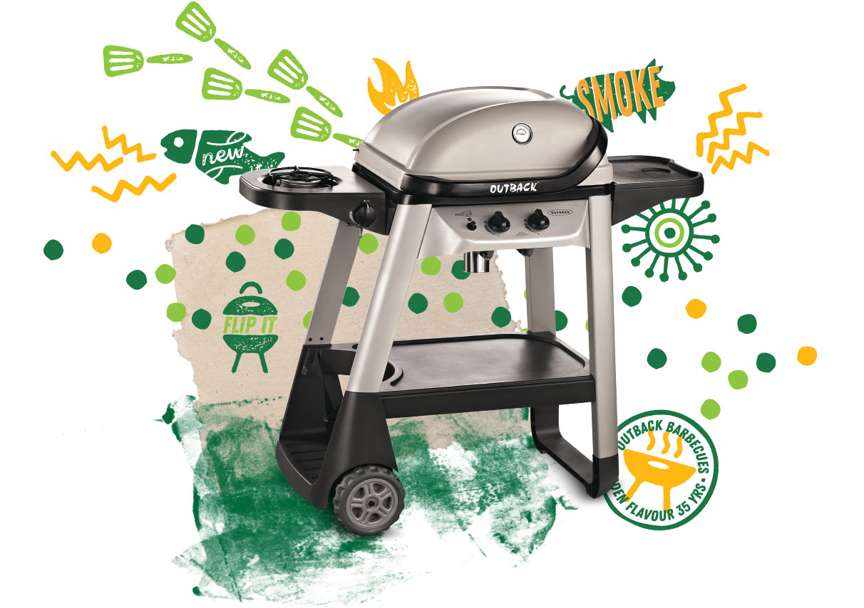
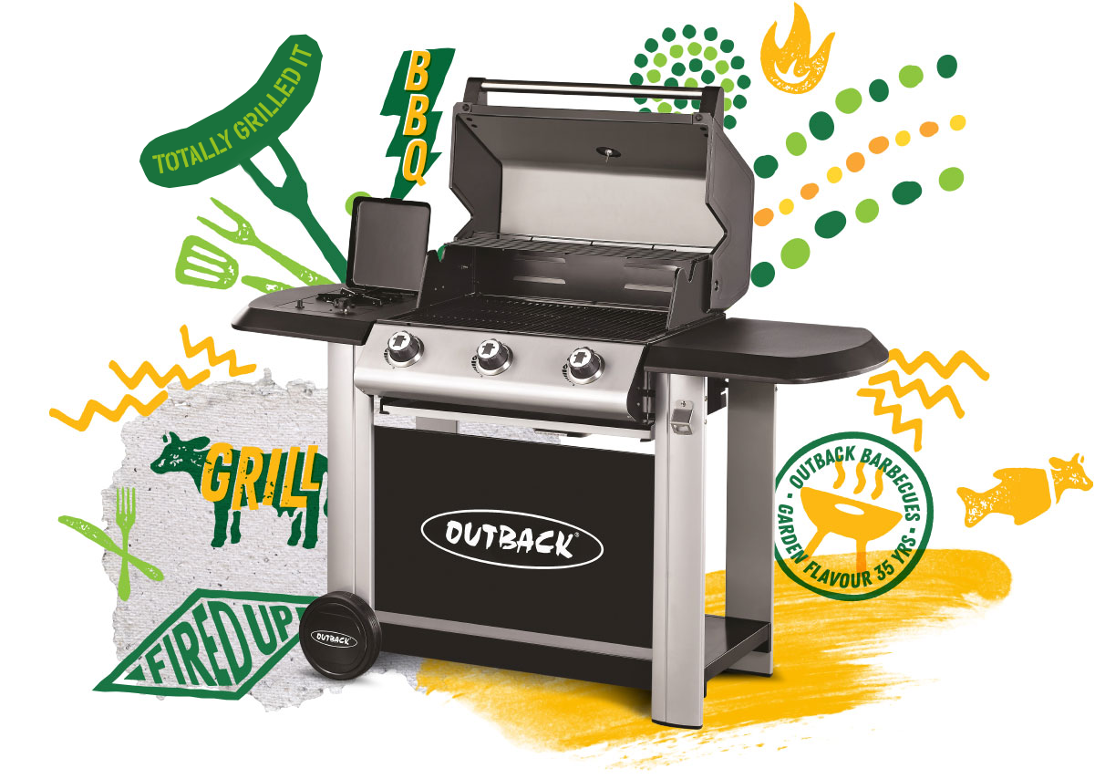
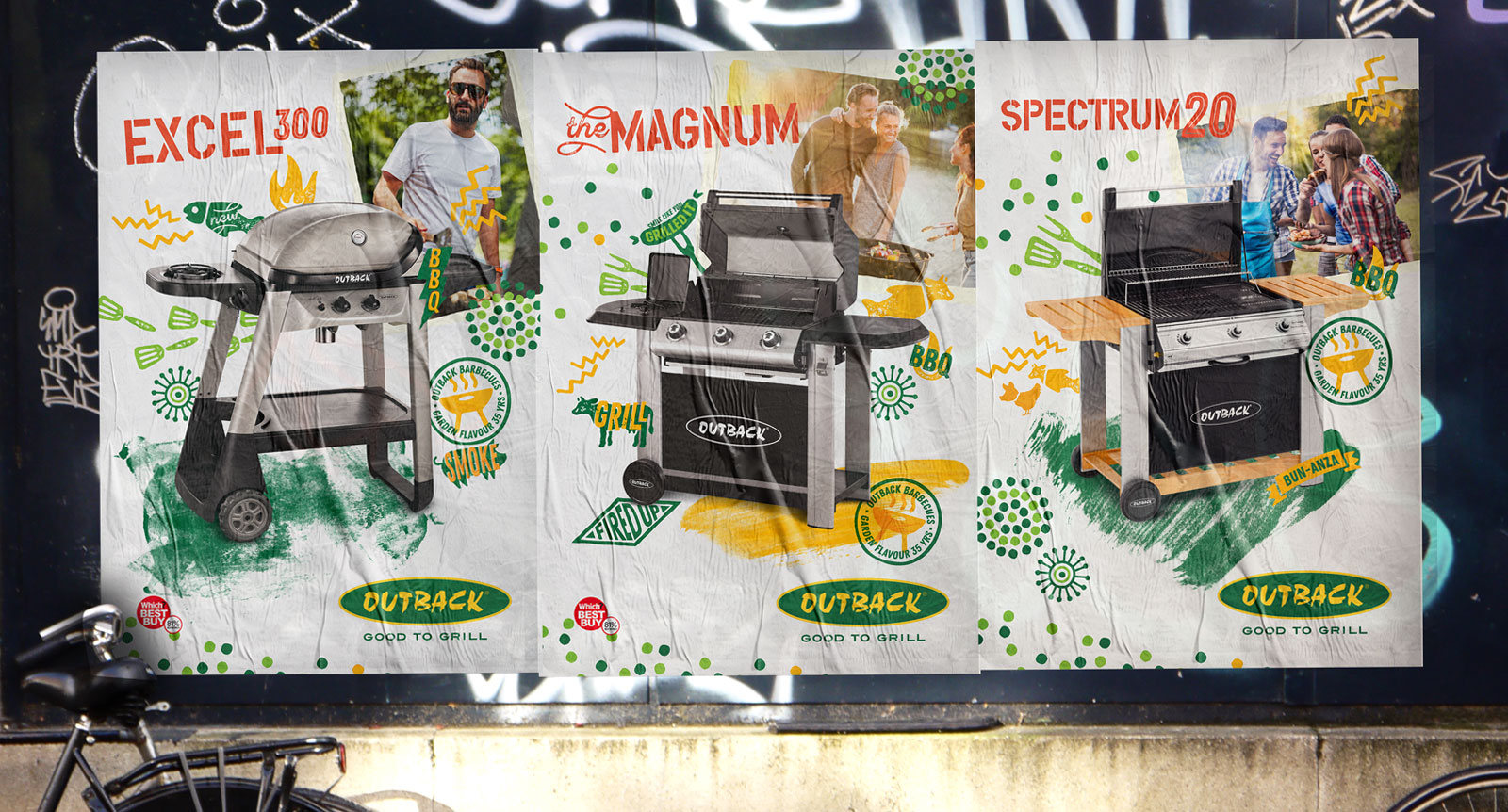
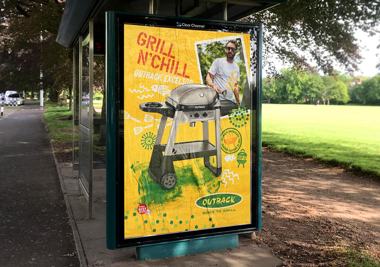
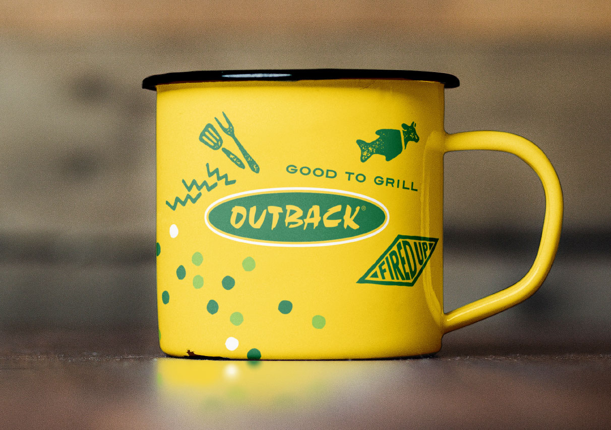
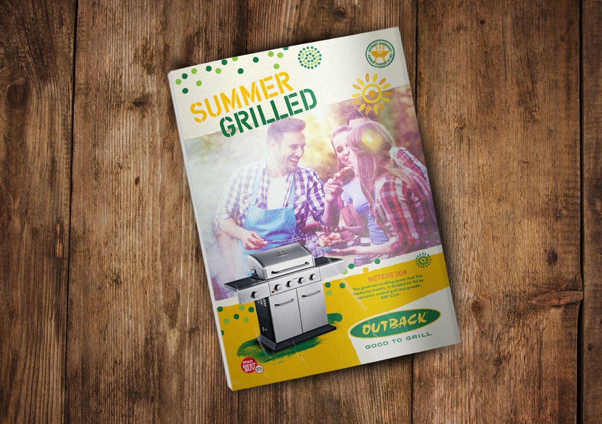
Leveraging illustrative elements inspired by ostensibly British humour, curiosities and quirks; Australian-inspired patterns and spirit; and the English country garden setting all centre around the hero — the product. The visual language plays off this collage of ingredients to create a distinct, characterful landscape. Its point of difference is a brand of imagination, quality and zest — evoking the true al fresco spirit of the great garden BBQ’ing adventure. Food, company, environment, weather, and finally the BBQ itself; fluid elements that come together to create the event. The positive ‘‘get out and grill’’ sentiment underscored by the positioning statement GOOD TO GRILL.

outback-assets.png
outback brand halo
outback brand halo
ads
outback brand
outback brand
outback brand
LGT had been recommended to us and we were excited by their bold vision for our brand. They identified genuine and marketable points of difference going into what is an exciting new chapter for us. Outback is a household name and the refreshed brand backs up our already great value product line. Mark Osborne, UK Chief Executive
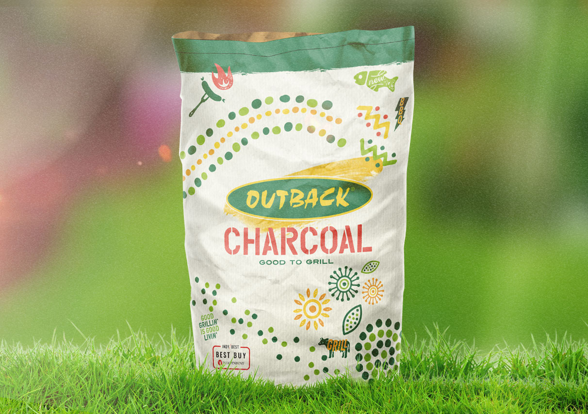
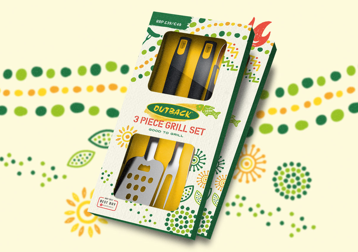
outback packaging
outback packaging

Cooking on Shopify

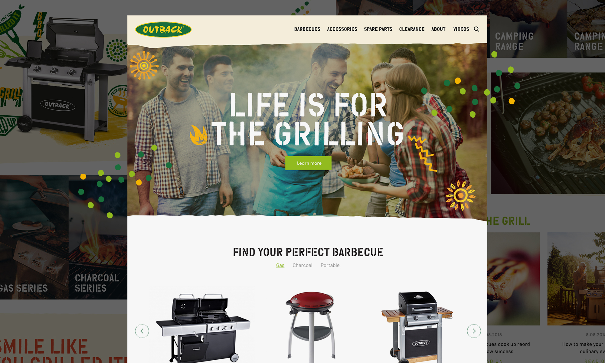
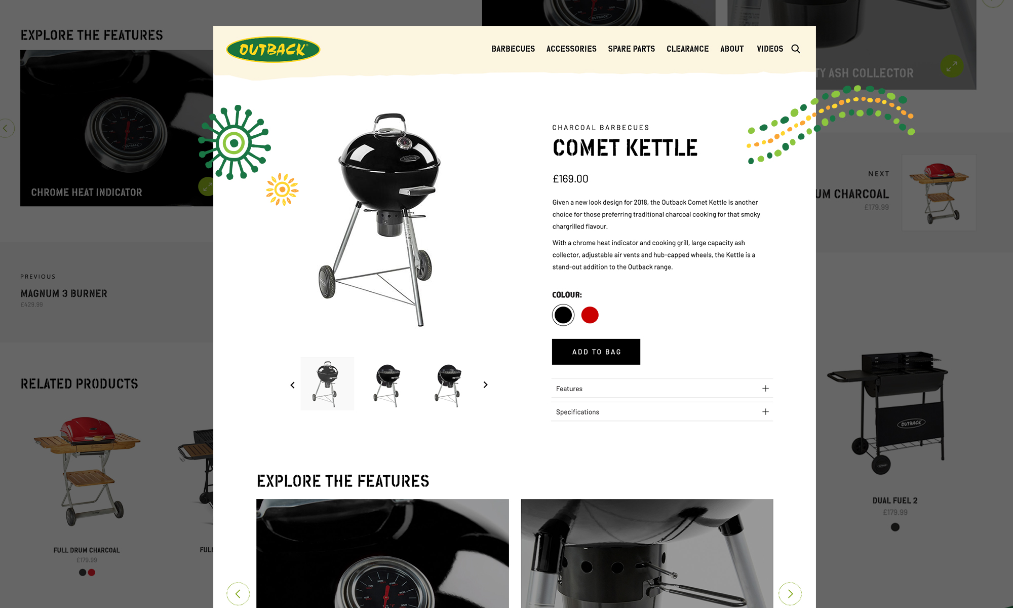
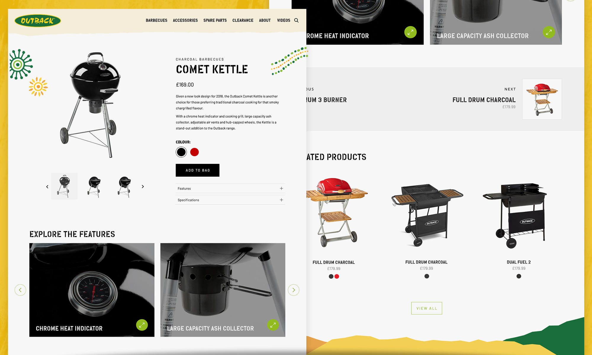
A new ecommerce website, built in Shopify, follows the visual identity in breaking from BBQ market norms of heavy use of black and chunky design elements. Instead, the site was wholly designed from the ground up, centred around a refined, fresher user experience and geared up for the growth of direct-to-consumer sales.

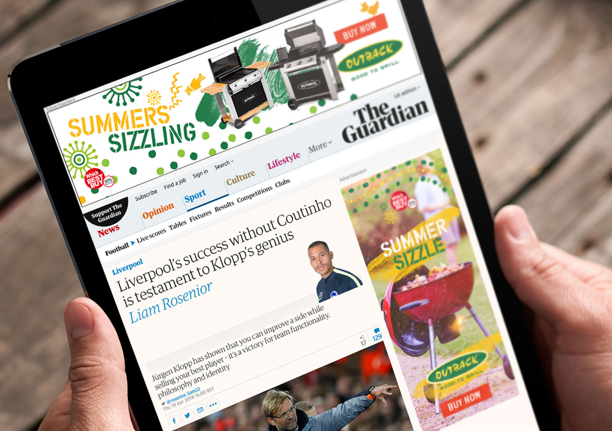
digital banner advertising
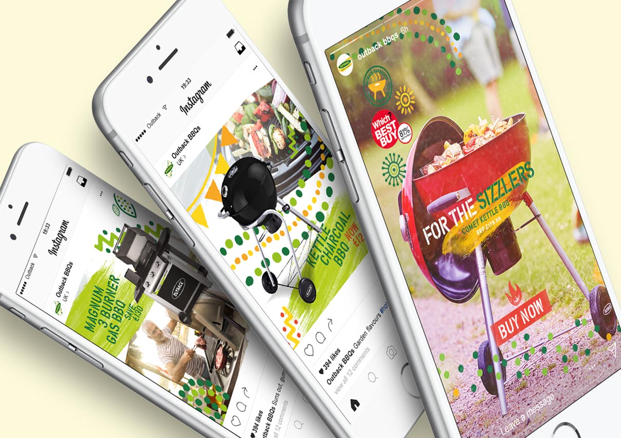
social posts
Homepage
E-commerce Product Page