We're hiring – Experienced UX/UI Designer wanted! Find out more

Keen branding identity

Keen Insurance

Seeing the bigger picture…

Services
  • Brand identity
  • Collateral
  • Environmental
  • Advertising
  • Website
Sector
  • Finance
Visit
Keen Insurance

Seeing the bigger picture…

Background

Originally founded in 1978, Keen Insurance provide tailored private and commercial insurance and investment solutions. It is to this day a thriving close-knit family business, with over 10,000 personal and commercial policies on their books from all over the UK. They were in need of a complete brand overhaul.

The insurance and financial sector have perhaps evolved more dramatically than most in recent times. Away from the traditional high street broker to an online market where the consumer has become their own adviser. For that reason the brief required imaginative thinking to portray Keen as a modern brand, communicating experience, trust, gravitas and expertise; without compromising on character or professionalism. Needing to inspire confidence, it sought to speak of the longstanding relationships Keen has nurtured over many years.


Keen branded golf ball
Keen brand identity

The strategy

With a strong heritage and an extensive portfolio of personal insurance services that outshine that of their competitors, it became apparent during early investigation stages that Keen’s approach is different. They step back, cast the net wide and create policies that wholly understand the broad risks; often placing insurance in niche circumstances or sectors that others simply cannot reach. And still at prices which are hugely competitive.

Locally the competition has largely remained immune to design and creativity. Conservative by nature, there are few bold expressions or stand-out brands and colour palettes seldom venturing too far from blue, red or grey themes. This makes it difficult to distinguish one firm from another. We set out to buck this trend.

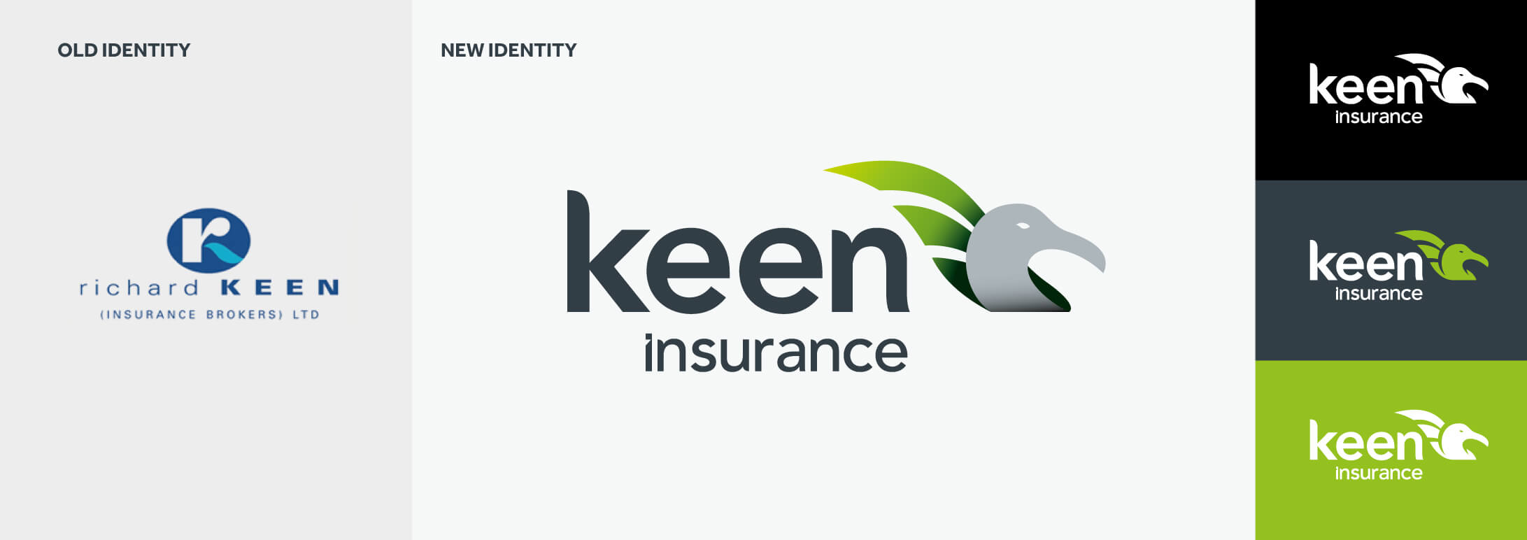
During our broad discovery process, it became apparent the albatross provided an interesting paradigm. One of only a few animal species to be monogamous by nature, they form often life-long relationships with their partners. Their significant wingspan affords them great reach, capable of circling the globe; all qualities Keen were able to identify with. We, therefore, introduced the albatross as the insignia and starting point of a cogent story and, coupled with a fresh lime green colour, created a bold, modern expression of the Keen identity.

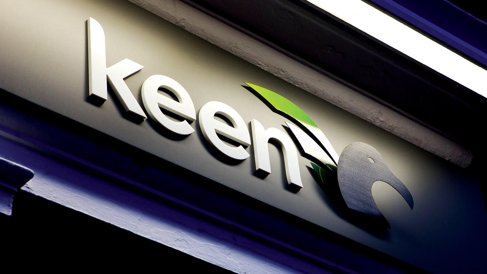
Keen brand signage

Big bird

Historically, the albatross is regarded as a bearer of good luck and a guide to shore in uncertain waters. In the poem The Rime of the Ancient Mariner by Samuel Taylor Coleridge, a sailor is made to wear an albatross around his neck as penance for shooting one dead and thus bringing bad luck upon his vessel. The Mark illustrates the bird proudly and vigilantly facing forward; an emblem of security, guidance and vision. Three feathers in the sweeping wing provide a nod to the three core services the business is built on; private insurance, commercial insurance and financial services.

We crafted the visual brand around a newly introduced strapline Seeing the Bigger Picture. A nod to both the vantage point of the high flying bird and Keen’s approach to tailoring cover based on assessing businesses and risk on an individual case-by-case basis, instead of a one-size-fits-all policy mandate. The imagery of big vistas and landscapes taken from above or at a height to amplify this message.

Keen logo single colour
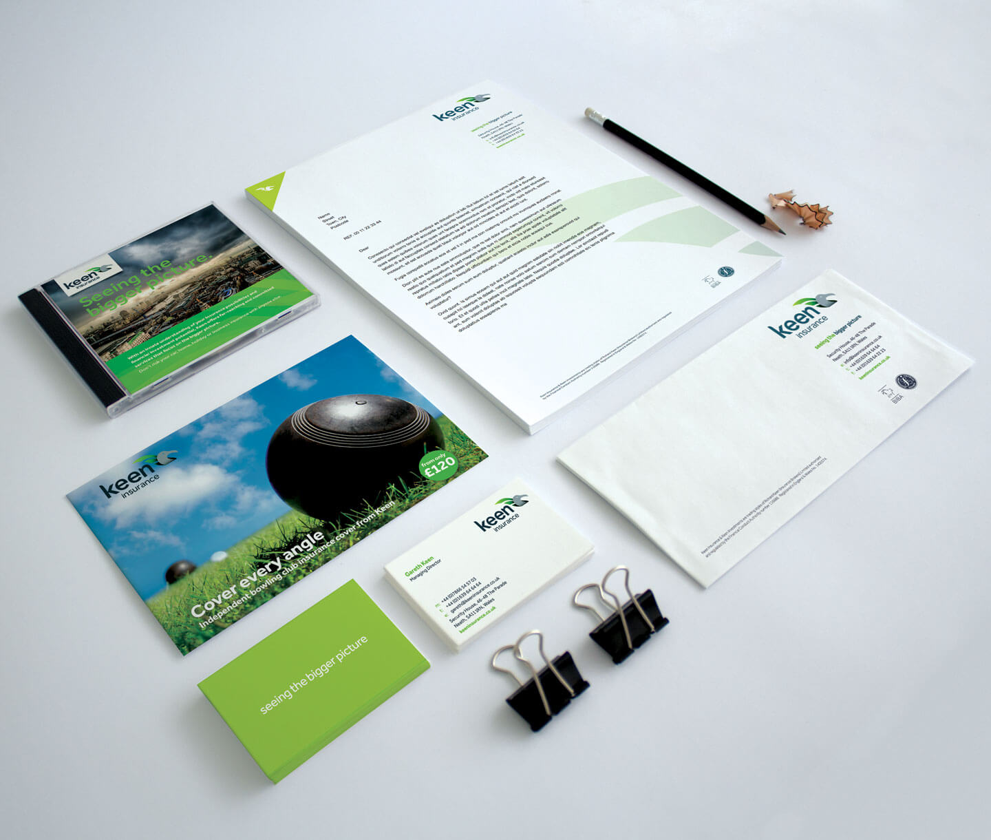
Keen branded stationery
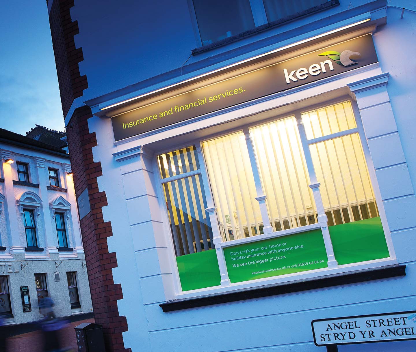
Keen building signage

Online

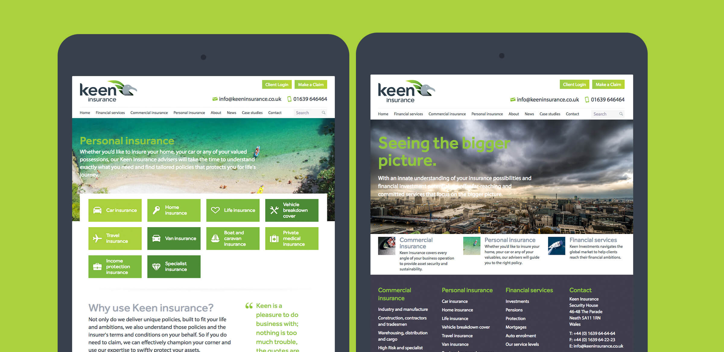
We designed and developed a new website – clean, informative and professional – decluttered from confusing industry jargon, and easily negotiable on mobiles, tablets or desktop computers. It presents Keen’s standing as a nationwide leading insurance broker. 

The project also encompassed signage, interior branding, photography, stationery, literature collateral and advertising.

Keen image style branding identity
image style branding identity
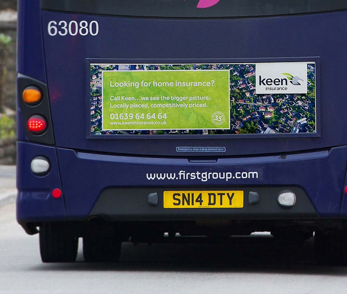
Keen bus back advertising
Keen responsive website
From the off the team approach was evident. Seriously, every person that I have dealt with at LGT has gone the extra mile and the final result is something that we are quite proud of. We have a beautiful new brand – but it so much more than that. Customers love the new look and prospects understand who and what we are more clearly. The staff are enthused and there is a real buzz about the business.

Having such a strong brand in place makes it easy to promote ourselves and I firmly believe that this rebranding process will be the springboard for our business for the next era. Thanks again to the Limegreentangerine team for their efforts and support; I couldn’t be happier with the outcome and I look forward to developing our partnership for many years to come. Gareth Keen, Managing Director