We're hiring – Experienced UX/UI Designer wanted! Find out more

ygin-header.jpg

Y Gin range

Ellers Farm Distillery

Services
  • Brand identity
  • Packaging
Sector
  • Food & drink
Visit
Y Gin range

Ellers Farm Distillery

Background

Ellers Farm Distillery is a new carbon-neutral, state-of-the-art distillery based in the naturally beautiful setting of the North Yorkshire countryside. The state-of-the-art distillery is one of the top three largest in the UK, capable of producing 2 million bottles per year, and has been built with a sustainable mission at its core. Carbon neutral since day one, with an ambition to be climate positive within three years, Ellers’ commitment to sustainable practices has earned them a Pending B Corp®.

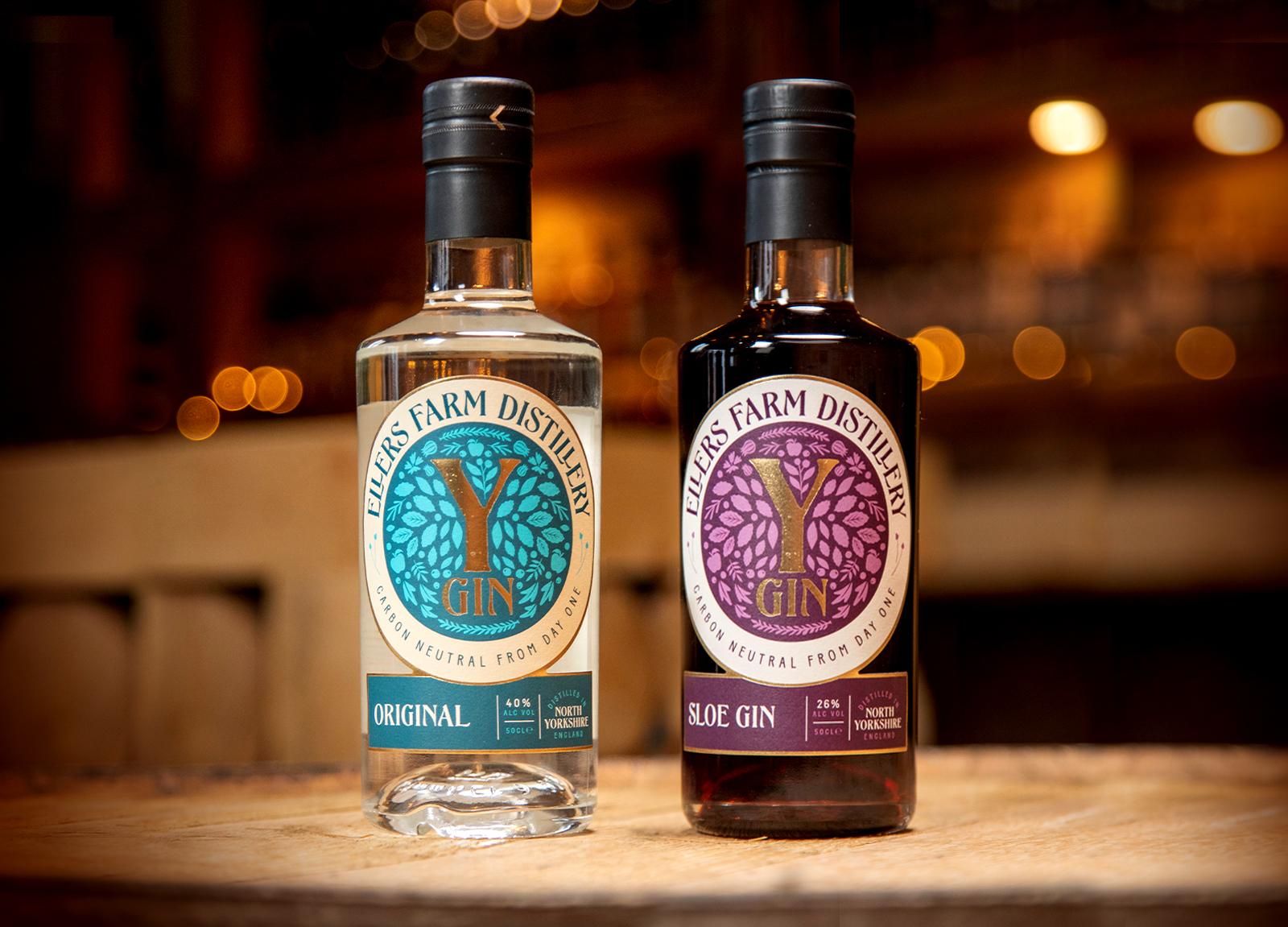
Limegreentangerine have designed the brand and packaging for their first eponymous range of gins and gin liqueurs, Y Gin (Y being a synonymous shorthand symbol of Yorkshire). First off the line are a dry, Original gin, and a moreish Sloe gin, with more to be added as locally-sourced ingredients become seasonally available. 
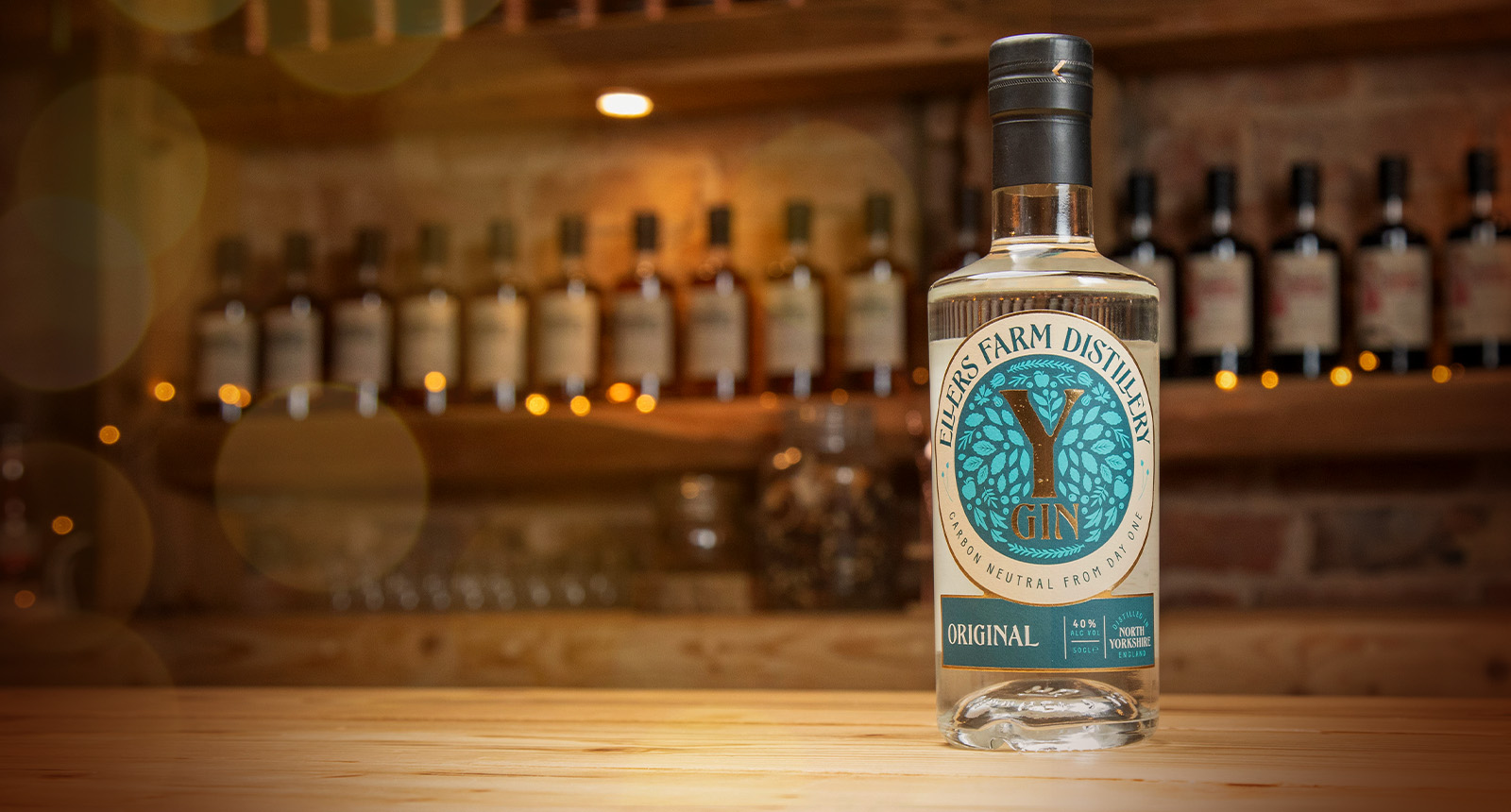
gin packaging range design

Good by nature

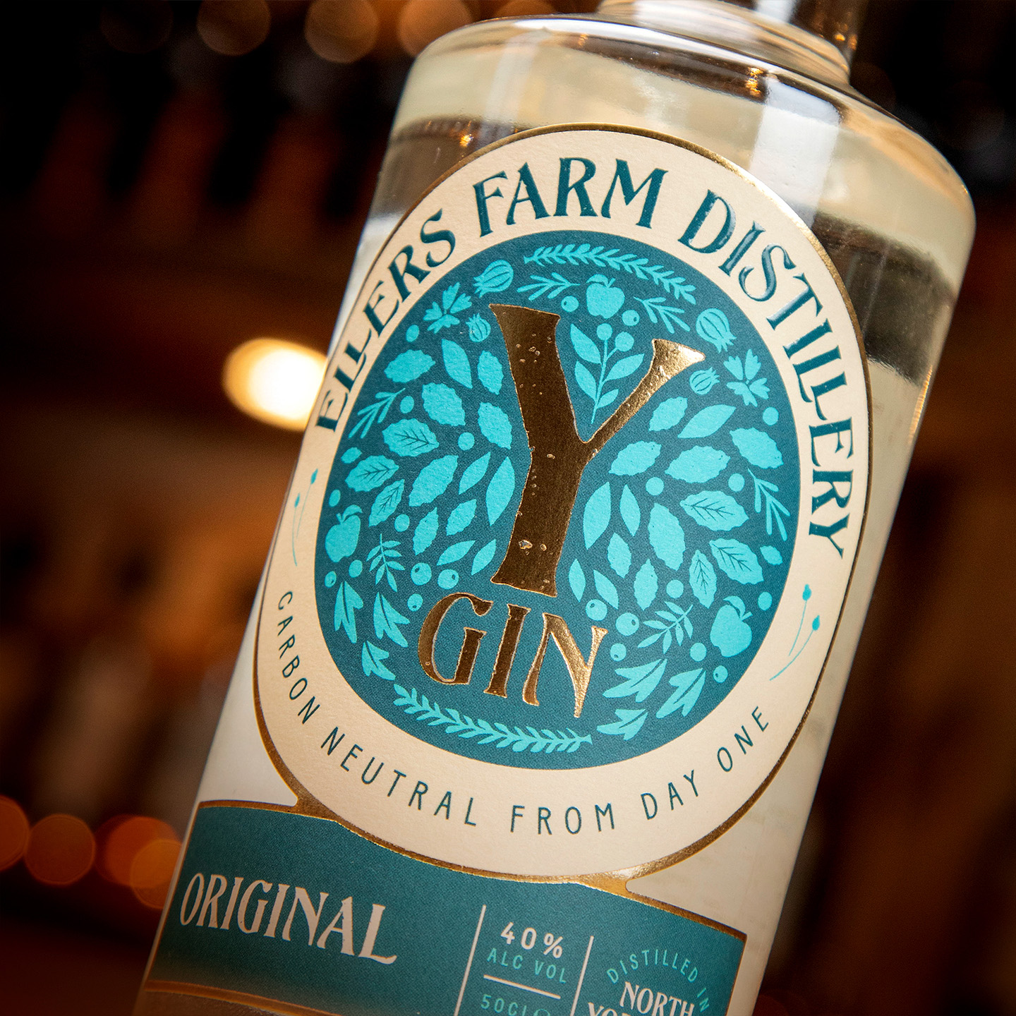
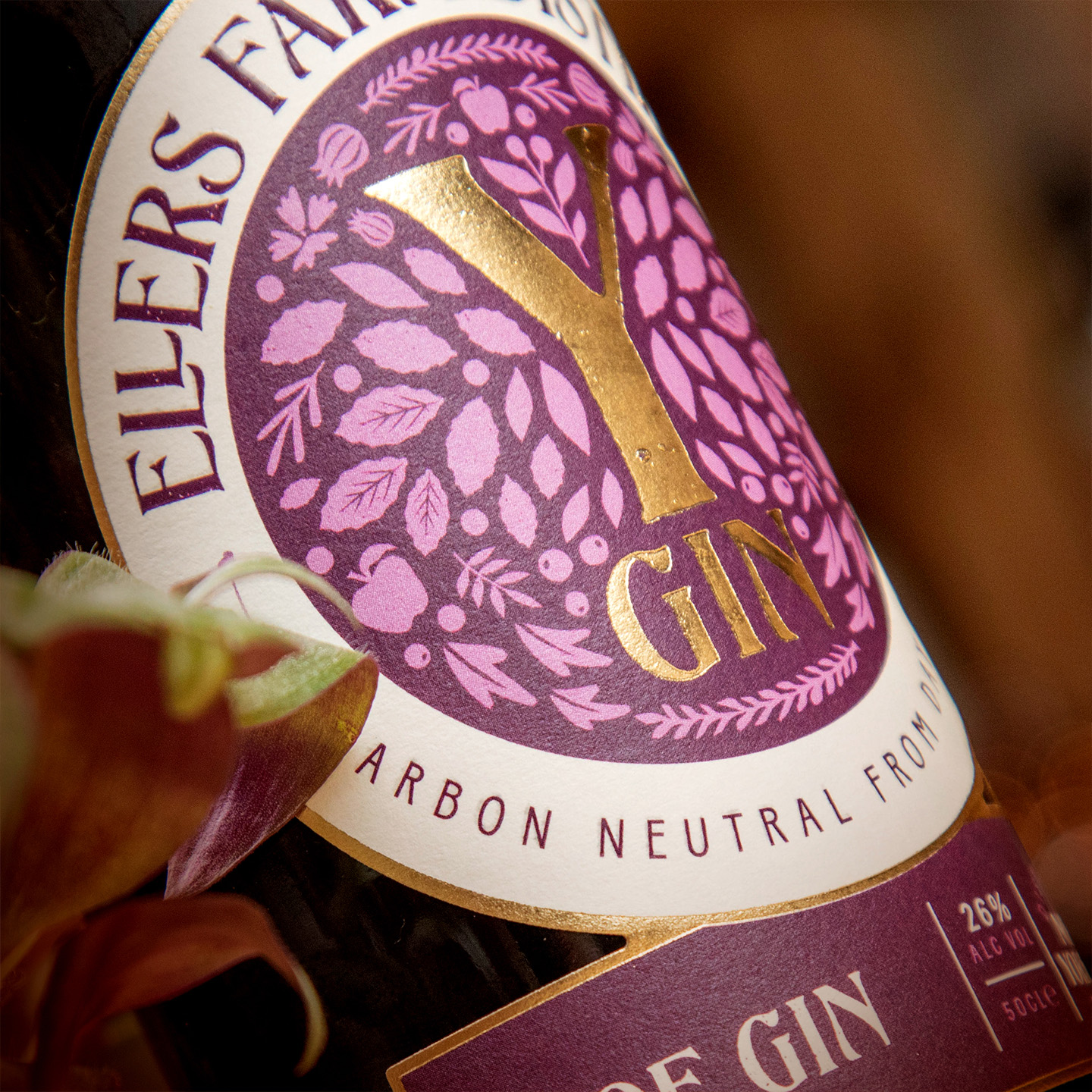
The labels feature Ellers’ bespoke typeface, EFD Headline, developed by Simon Walker of Beasts of England Foundry, an adaptation of his retail typeface, New Forest. Connecting people with place, purpose, and product, the labels tap into an illustrative expression of their unique, naturally rich Yorkshire enclave.

Printed on an ultra-tactile uncoated stock and finished with a flexo matt varnish, gloss tactile silkscreen, and hot foil gold, the labels extend the Ellers Farm destination brand visual, also created by Limegreentangerine.

gin label design
gin packaging design photography
Cannot get over how beautiful these labels are. We’re in love. Mia Dickinson, Marketing Executive
gin social
gin marketing