We're hiring – Experienced UX/UI Designer wanted! Find out more

Bryngarw branding identity

Bryngarw House & Park

Building a sense of place…

Services
  • Brand strategy
  • Brand identity
  • Collateral
  • Brand guidelines
  • Website
  • Copywriting
Sector
  • Hospitality
  • Leisure
  • Tourism
Bryngarw House & Park

Building a sense of place…

Background

Built in the 15th Century, Bryngarw House is nestled within 120 acres of beautiful and, in parts, exotic parkland in the Garw Valley. Bridgend County Borough Council’s problem lay in the fact the park and the house had been operating as separate entities, under their own tired brands for years. They needed to unite the two brands to strengthen each offering and increase their bottom line.

The project brief placed emphasis on reconnecting heritage and healthy living within the estate; people with place, nature and natural environment, along with people and natural heritage through traditional craft and maintaining habitats and wildlife. It’s a place where people can go and find simple but authentic grounding experiences.
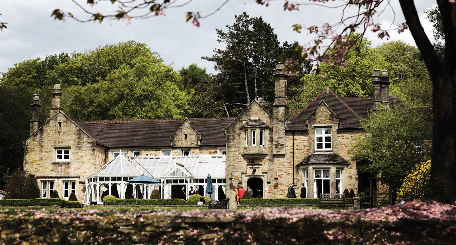
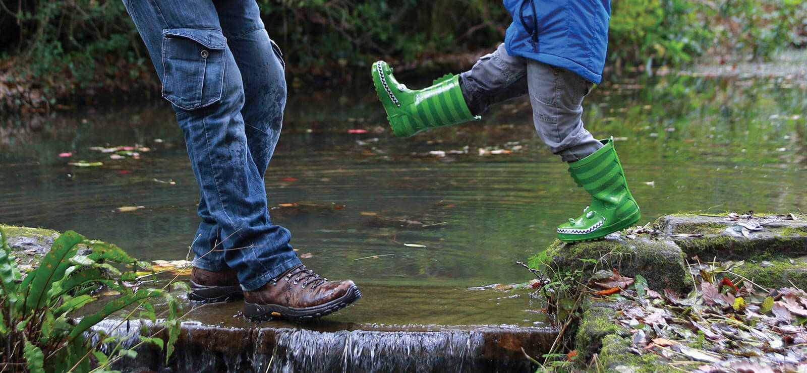
branding photography Wales
watercolour2.jpg

Closer to nature

The rebrand coincided with the refurbishment of the house’s restaurant, accommodation and conference facilities, augmenting a thriving wedding offer. Therefore, the future sustainability and the latent potential of Bryngarw lie in bringing its constituent parts together to form a seamless experience; both to increase commercial strength but also highlight their unique product.

Our task was, therefore, twofold; to design a modern identity and to develop a layered visual narrative that would equip Bryngarw with a unified brand architecture.

The primary challenge in creating a robust new identity was how to best reflect both the house and the park without relegating one or the other. The two needed to be seen as one, feeling established and familiar whilst capturing the estate’s spirit.

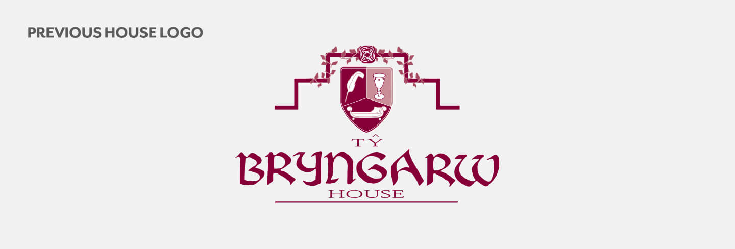
previous bryngarw house logo
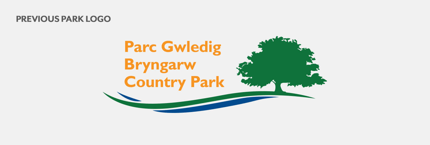
previous bryngarw park logo
Bryngarw identity
research and inspiration
identity

Woven by nature

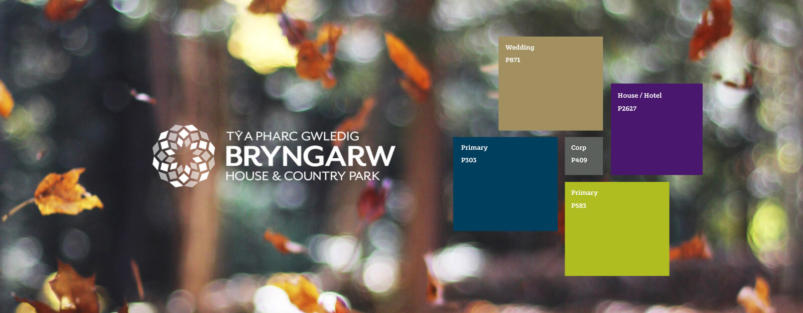
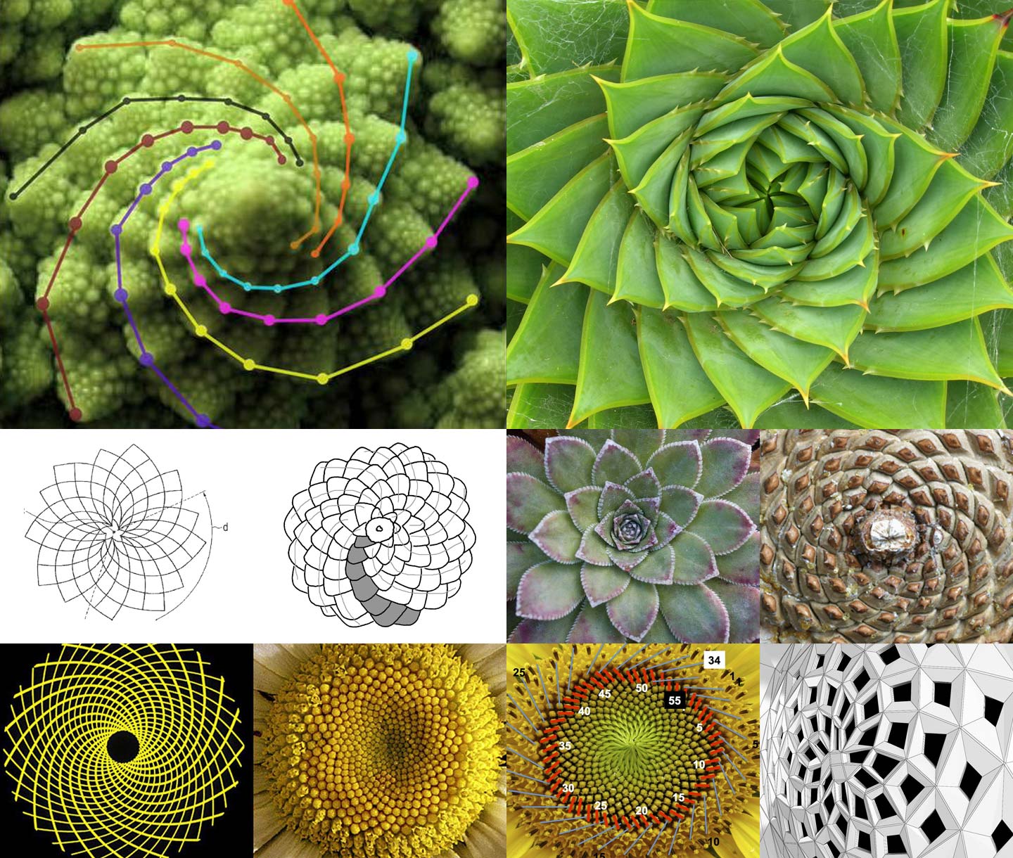
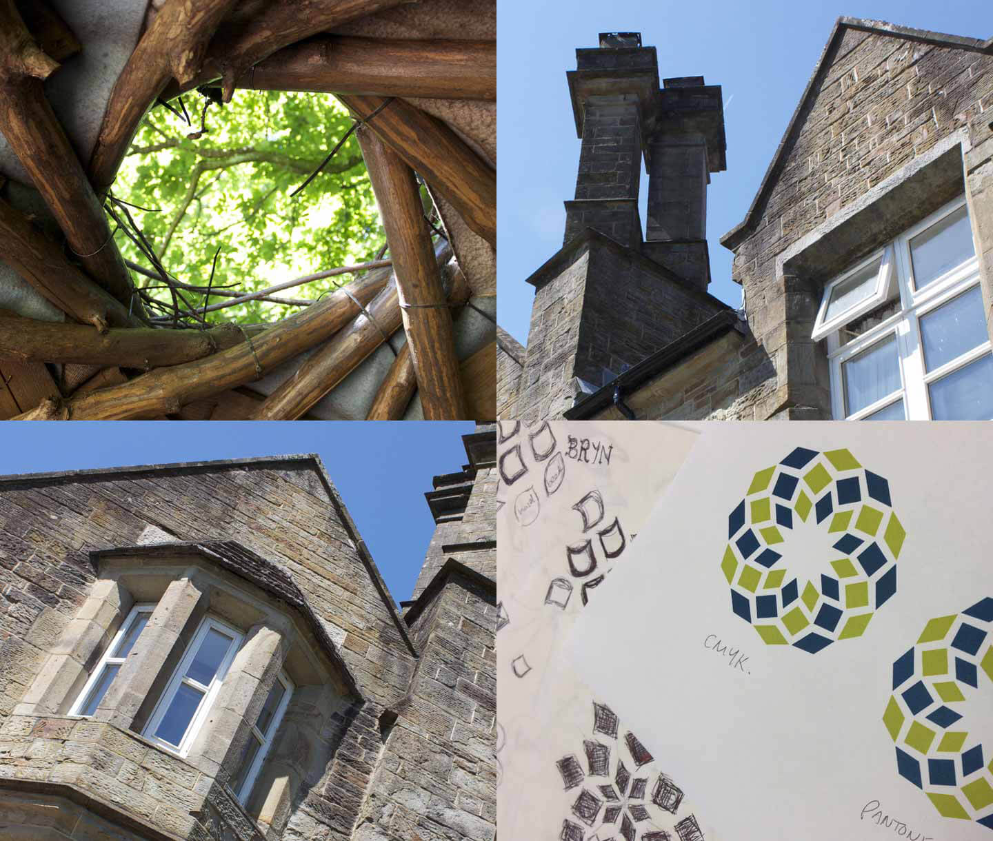
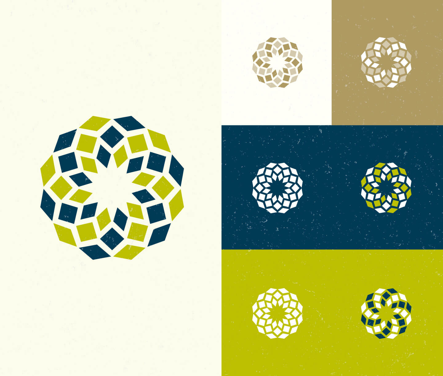
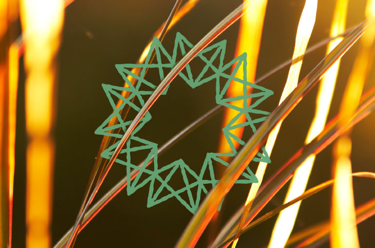
The new identity was inspired by the phenomenon of phyllotaxis patterns – the arrangement of leaves on a plant stem. These spiral shapes are distinctive, natural patterns and, along with the angular details through the architecture of the house, create a woven Mark that couples the house with the park. It echoes the mosaic of habitats that make up the grounds; from the Japanese garden to the sycamore wood, wildflower meadows and the wet woodland, ornamental lake and beyond. An apt symbol of a harmony of parts.

Bryngarw identity, bird perching
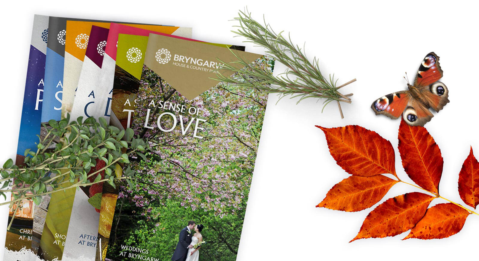
Bryngarw Spring Brochure Bryngarw Summer brochure design Bryngarw print design

For all seasons

The primary colours, an earthy blue and green, further highlight this connection, with the notion of movement imparting an impression of natural renewal.

Freshly commissioned photography presents an invigorating, immersive overture, whilst the wedding collateral frames romance through the natural drama of the backdrop.

brand in copy
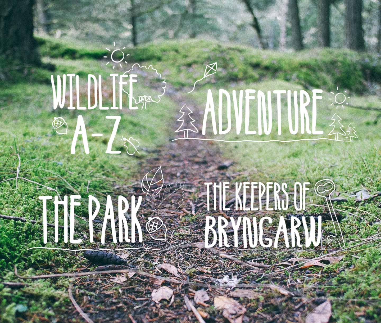
hand drawn assets

A sense of...

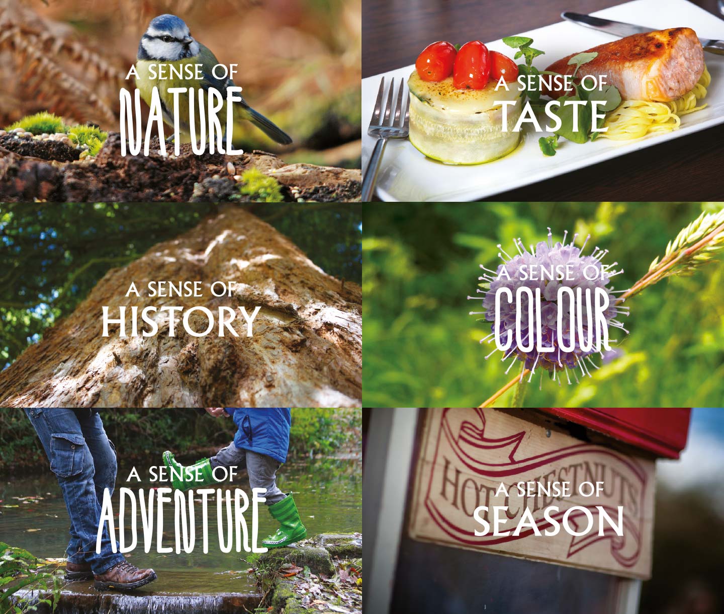
Copy fused with imagery takes ownership of a new strapline, anchoring the Bryngarw experience. Used flexibly to spotlight an experience, event or theme; ‘‘A Sense of Place, A Sense of...’’ is completed with ‘‘Nature / Occasion / Taste / Season / Style / Romance / Drama / Season / Comfort / Adventure / Wonder…’’ and so on.

The brand gained real depth through a use of three distinct typographic styles applied to the house, park and wedding collateral, mixed with vivid colour and texture, illustrations and bold photography.

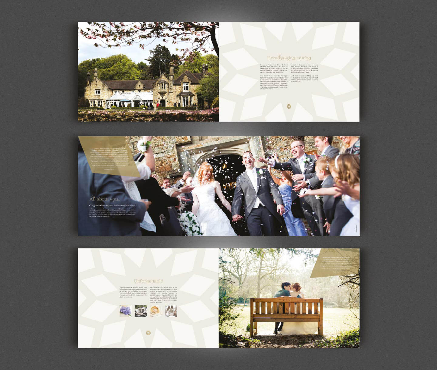
wedding literature design
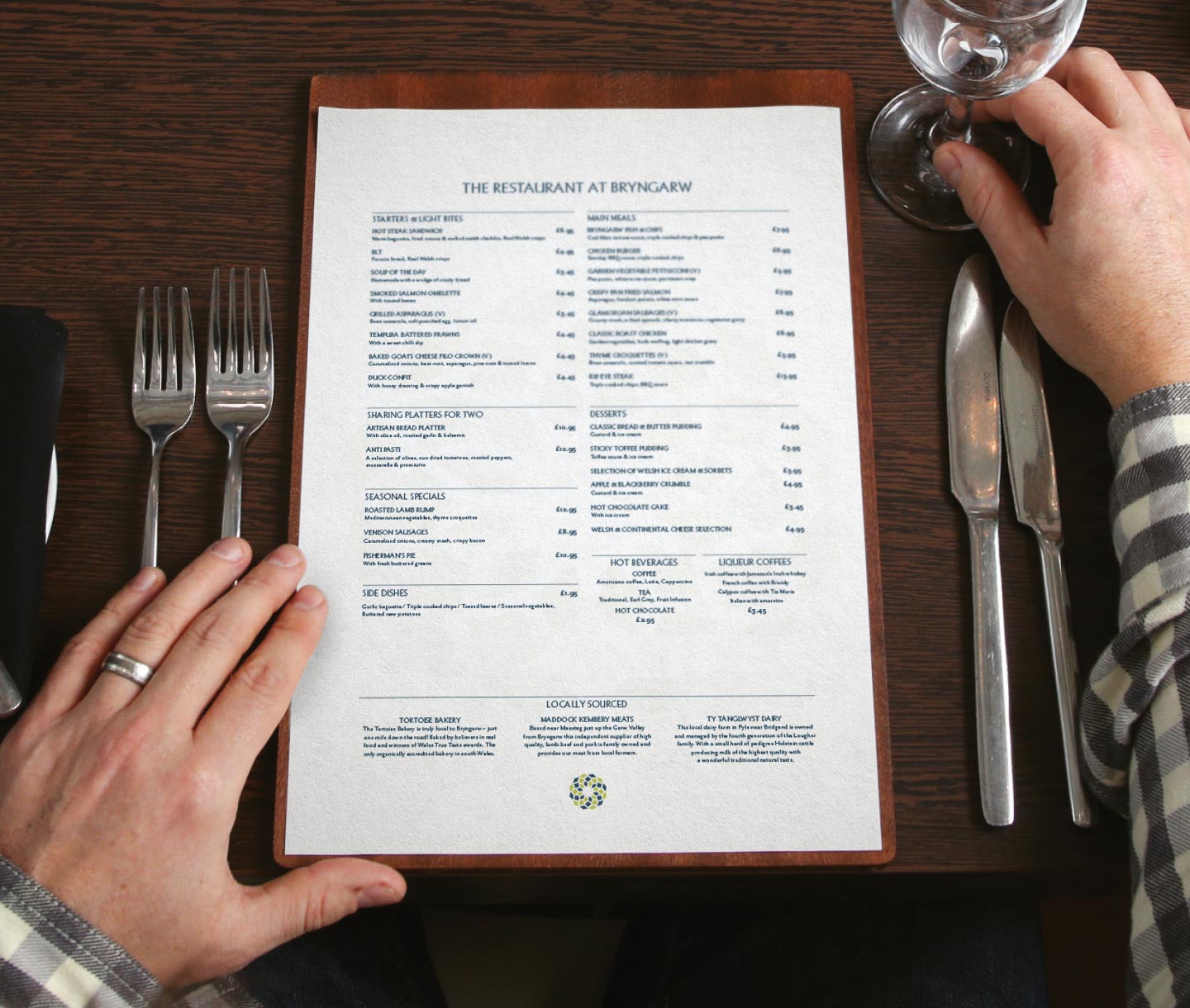
menu design

Making our nest

Bryngarw’s wedding offering was already a hugely successful and thriving enterprise, so it was imperative it was given its own distinctive look and feel. Simple gold tones are employed throughout the marketing, anchored by the stunning imagery and the introduction of Jessica Hische’s playfully elegant font Brioche, to fuse personality with grace.

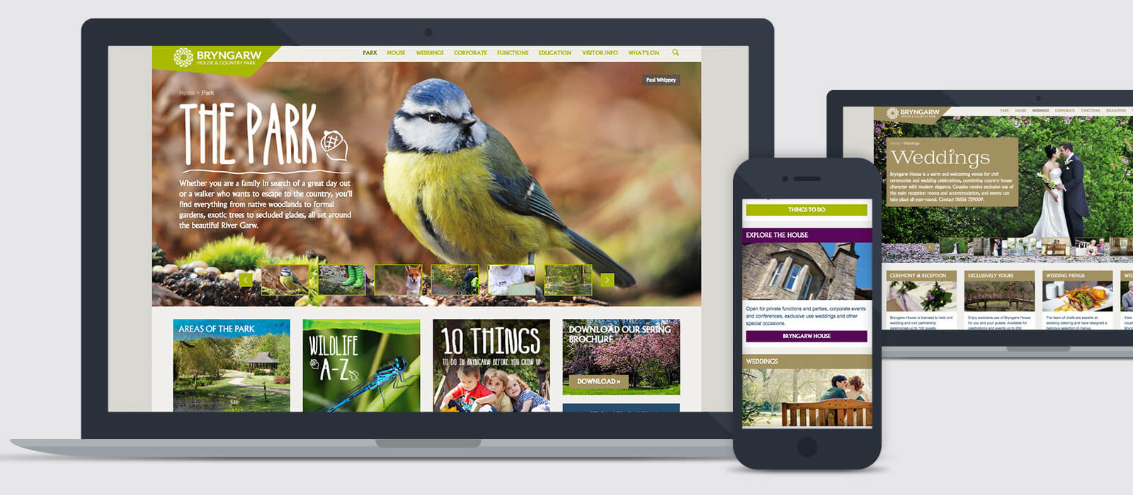
The project included designing and building a new responsive website that presented each facet of the business – whether it be the park, restaurant, wedding or business services. Each has their own distinct, complimenting look and tone, making it easy to get to know Bryngarw and together strengthening the brand as a whole.


bryngarw literature design
bryngarw website design
Bridgend County Borough Council went through a thorough tendering process to bring an agency onboard to share our vision and help rebrand Bryngarw House & Country Park. This included a new brand, identity, literature suite and a complete overhaul of the website.

Limegreentangerine understood the concepts, budget and our requirements and were hugely enthusiastic and creative from the outset. This helped make the whole process (which can often be complex when there are so many stakeholders) very enjoyable and the transition from the old to new brand was smooth. The new identity was very well received both internally and externally and since launching our new website we have received an increase in visitors and, importantly, online bookings.

Their team ensured every element was covered from very initial ideas to colour palettes, straplines and art direction, ensuring consistency and effective use of the brand over a variety of marketing channels. The early signs of the rebrand have been hugely encouraging and will hopefully help Bryngarw become more competitive in its market and bring new visitors to the grounds. We are very pleased. Kelly Jones, Project Manager