We're hiring – Experienced UX/UI Designer wanted! Find out more

ACT branding

ACT Fujitsu

The UK’s leader in smart card technologies

Services
  • Brand strategy
  • Collateral
  • Advertising
  • Brand guidelines
  • Copywriting
Sector
  • Technology
ACT Fujitsu

The UK’s leader in smart card technologies

Background

Fujitsu-owned ACT (Applied Card Technologies) is the UK’s leader in smart card technology and digital transactions. Powering over 1.1 billion (yes, billion) transactions per day including digital travel ticketing, e-money schemes, tourism and loyalty programmes, ACT are recognised as the sector leader and innovators. Clients include Arriva, Great Western Railway and National Express.

ACT’s technology harnesses and manages complex workflows, transactions and data relating to their customers’ business operations. This presents real-time, simplified business information that supports day-to-day smart card operational management.

We were appointed by ACT to distill and redefine the positioning strategy and visual language, to lay foundations for how the brand should behave and speak in all its communications in order to drive the sector narrative.

ACT operations

Strategy

Their back office technology, although complex, is essentially invisible. It underpins and bridges networks between software and hardware (such as ticketing gates). Consequently, customers are only really likely to know about ACT when something goes wrong. The task, therefore, was to develop an intelligent, visual way of educating customers, many of whom may not be technical.

Understanding these challenges and the market, we developed the proposition ‘Fluidity Connected’. This spirit anchors the brand vision and spotlights the core business benefits, illustrating how ACT function ‘under the hood’.

'Fluidity Connected' is a powerful vision of intent, a statement which defines ACT’s mission to enable intelligence-led operations and pro-active, individual customer engagement through the delivery of real-time information across organisations, systems, platforms, devices and standards. Fluidity in information means fluidity in business and, as a result, a truly connected enterprise. 

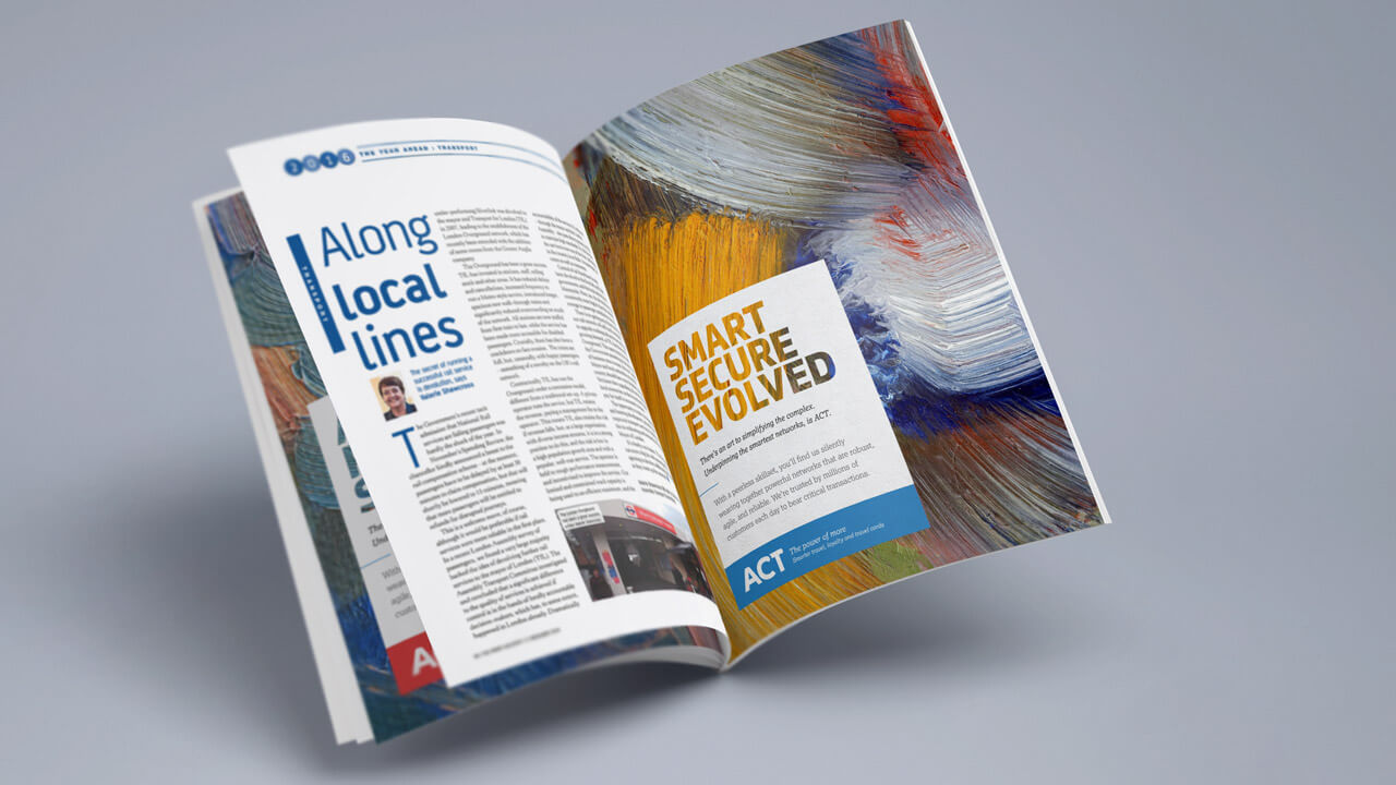
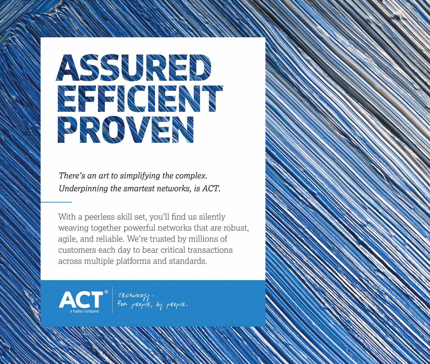
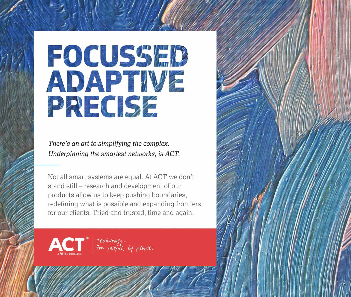
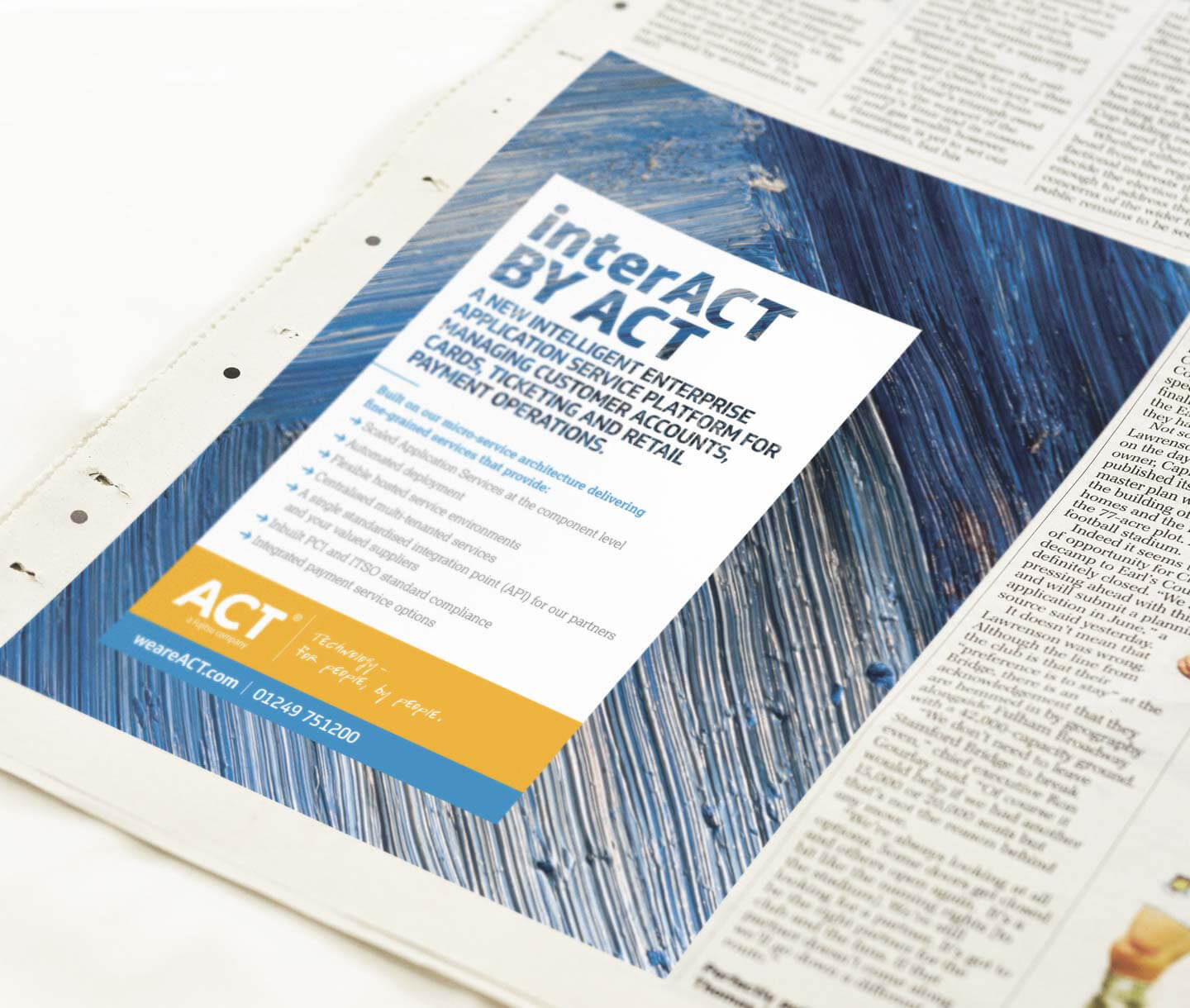
ACT Advert
headline graphical element

Language

This statement informs the tone of voice and messaging matrix. Asyndetic headlines create assertive messages that replicate the triplex rhythm of 'A. C. T' into punchy, authoritative statements. These are then followed with specific, cited examples of performance.

act-guides-cvr.jpg ACT brand guideline document act-guides-2.jpg act-guides-3.jpg act-advert.jpg

Ebb and flow

Critically, they wanted a bold system that worked together – a system that was greater than the sum of its parts. When anybody sees their website, business cards, literature or PowerPoint slides, they had to see a close-knit family; a look that transcends just a logo. When someone sees an ACT document, they have to know: “that’s ACT” without looking for the brand name.

To achieve this, magnified free paint strokes were used to express the concept of innovation and freedom afforded by technology, suggesting the ‘infinite’ and the ‘fluid’ – a wider picture. The graphic language is energetic and colourful. These expressive textures radiate and pulse giving an illusion of movement, energy and connectivity; capturing the ACT network’s ebb and flow and technological progression. A vivid colour palette and impactful typography move ACT confidently forward. 

ACT advertising Cardiff
ACT brand design Cardiff staff badges

Clarity

We created a graphic world based on analogies of complex technology: the wider the viewport, the clearer the journey and experience becomes. A metaphor for the current complex landscape of smart transaction management, versus the clarity that ACT is able to deliver. The ACT headline statements provide the aperture, inviting the viewer to peer through to see more – under the bonnet as it were – signalling the technology's knit.

ACT is all about making the confusing and closed, clear and transparent; a response to the commodification of the market making differentiation opaque and confusing. The brand captures the essence of the proposition, smartly elevating it above the competition with sophistication and authority.

We have an extremely technical and complex product which is marketed to a demanding and informed audience, driven by bottom line. We choose not to compete on price, instead educating our customers of the value of our services, therefore it’s critical we communicate on a more considered level to that of our industry peers. Limegreentangerine really got to grips with our challenges and understood our product and workflows. Their solution translated this wonderfully creatively and provides us with real point of difference in the market. Joanne Hutchinson, Marketing Manager